Pastel gouache delight and an 'At last!' headline give modern chores retro drama — nostalgia earns the double-take.
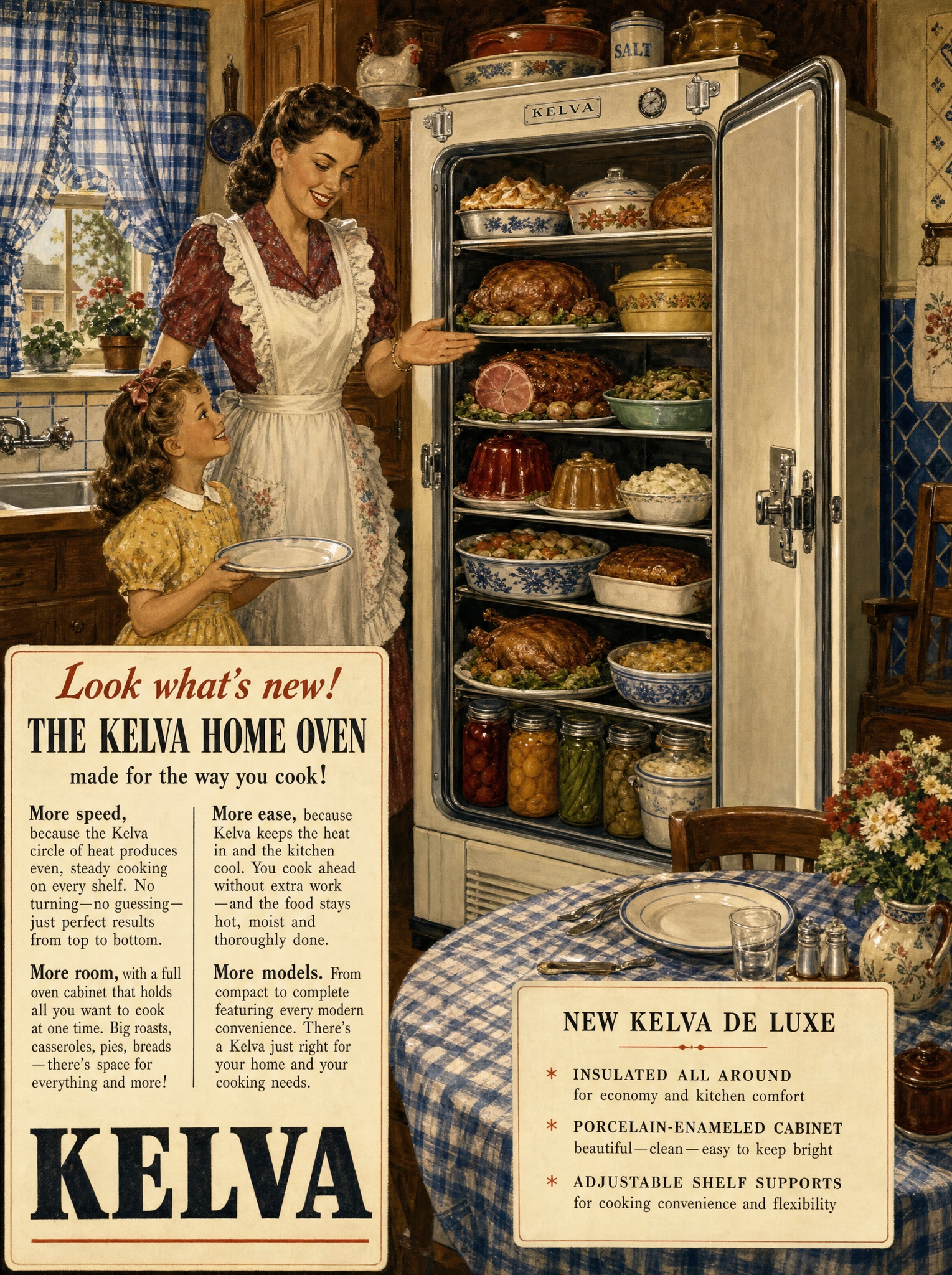
Vertical 4:5 vintage late-1940s American magazine advertisement painted in rich storybook realism — dense, warm, detail-packed domestic illustration. Scene: a cheerful mother in an apron stands beside [PRODUCT — e.g. "Kelva, a full-height home pantry oven, its door swung wide open"], the interior absurdly abundant — every shelf loaded with colorful dishes, roasts, jellies and bowls painted in loving miniature detail — while a child waits eagerly beside her holding a plate. Surround them with cozy period texture: blue gingham curtains, patterned wall tiles, wooden cabinets, a set kitchen table. Lower left: an inset white copy panel with a three-tier headline, verbatim: "[INTRO LINE — e.g. "Look what's new!"]" in friendly script-serif, "[PRODUCT LINE — e.g. "THE KELVA HOME OVEN"]" in bold serif caps, and "[TAIL LINE — e.g. "made for the way you cook!"]" in small serif. Beneath, two narrow columns of tiny serif body copy where every paragraph opens with a bold parallel lead-in: [LEAD-INS — e.g. "More speed,", "More room,", "More ease,", "More models."]. Panel bottom: the wordmark "[BRAND — e.g. "KELVA"]" in heavy serif capitals. Right side: a second small white box titled "[SPEC BOX — e.g. "NEW KELVA DE LUXE"]" holding three lines of feature micro-copy. Gouache-and-oil finish, aged paper tone, period palette. No photography, no modern appliances beyond the product, no watermark, every quoted word exact.