A full app-store page for your product — Editors' Choice badge, screenshots row, and reviews that roast themselves.
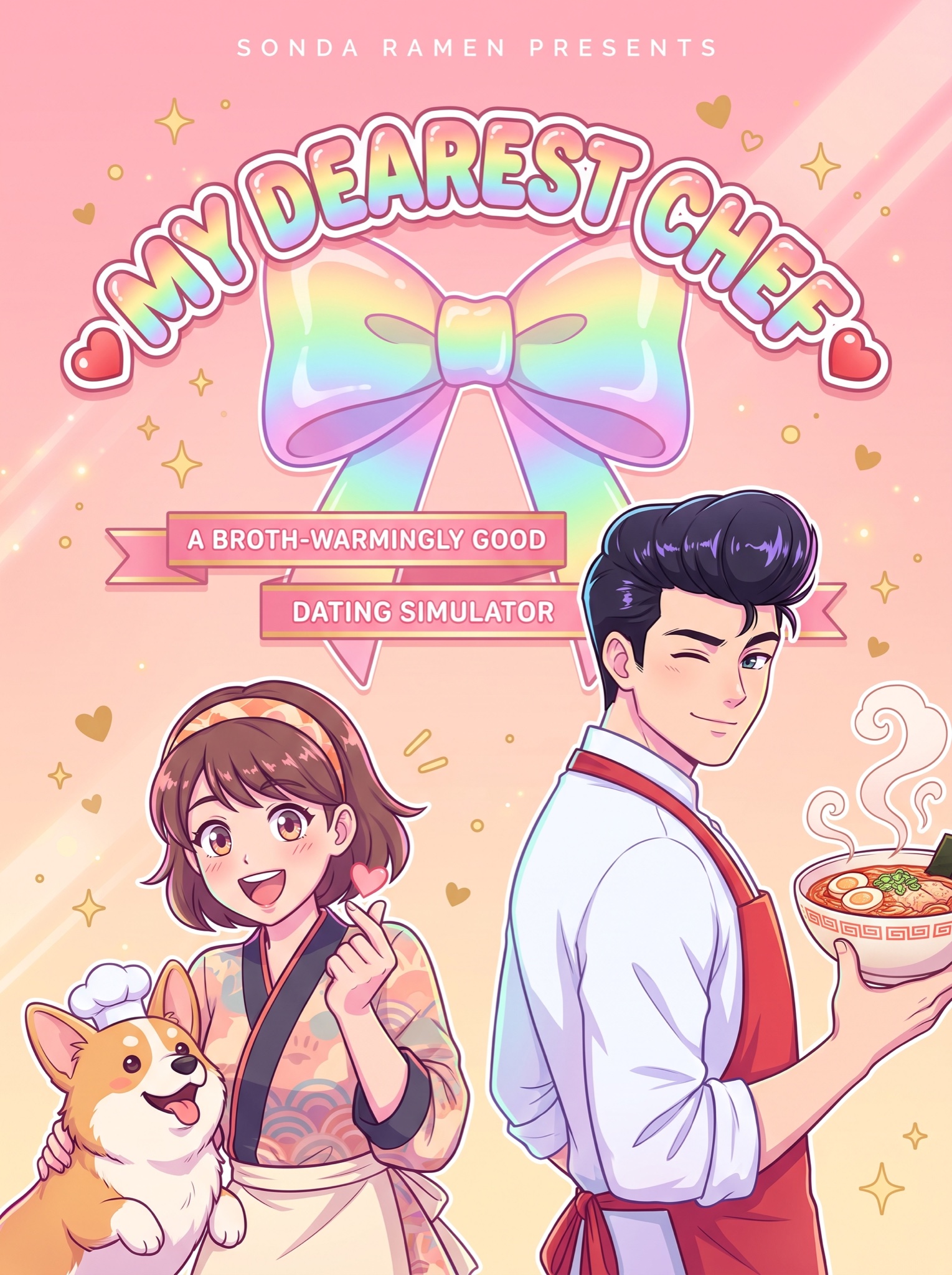
Vertical 4:5 static ad styled as key art for a fictional romance visual-novel game — glossy anime illustration, not photography. Background: a soft pink-to-peach romance gradient dusted with sparkles, tiny hearts and diagonal light streaks. Center: a big arched title logo in juicy rainbow-gradient bubble lettering with a white outline and candy shine, framed by two small heart dingbats, reading [GAME TITLE — e.g. "MY DEAREST CHEF"]. Behind the logo, a giant glossy gradient ribbon bow. Beneath, on slim pink ribbon banners in small caps: [SUBTITLE — e.g. "A BROTH-WARMINGLY GOOD DATING SIMULATOR"]. Top center in tiny letter-spaced caps: [KICKER — e.g. "SONDA RAMEN PRESENTS"]. Flanking the logo, two cel-shaded characters in crisp dating-sim style: right, an impossibly handsome young chef with glossy dark pompadour hair winking over his shoulder in a red apron, holding [PRODUCT — e.g. "a steaming bowl of Sonda spicy ramen"]; left, an excitable culinary-student heroine mid-finger-heart, plus a chubby corgi in a tiny chef hat. Pastel rim light, gleaming highlight dots in every eye, flat clean line work. No real game-store framing or buttons, no real restaurant mascots or logos, no elderly goateed mascot lookalikes, no photorealism, no watermark, all lettering crisp and correctly spelled.