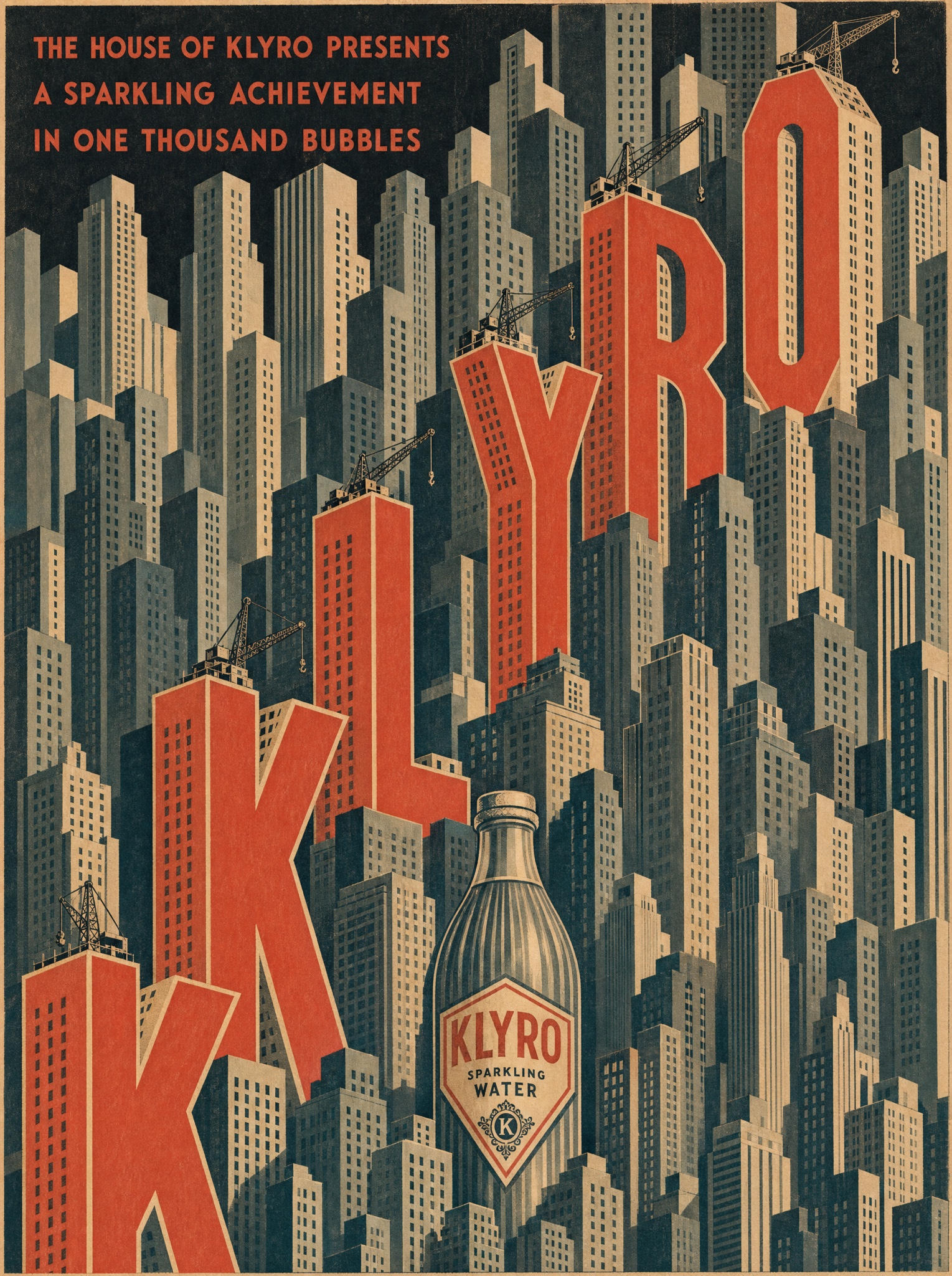
Monumental product, geometric rays, three inks — deco poster grammar makes anything look like a luxury liner departure.
Vertical 4:5 vintage 1920s modernist poster lithograph in flat matte inks. The entire frame is a dense stylized city of stepped skyscrapers drawn as flat geometric slabs with tiny gridded windows, buildings stacked to every edge with no open sky. Climbing diagonally through the city from bottom left to top right, the letters of the product name are themselves colossal three-dimensional buildings — each capital a coral-red tower with cream side faces standing among the grey-green blocks — spelling "[BRAND — e.g. "KLYRO"]" one monumental letter at a time, with tiny construction cranes perched on the tallest letters as if the name is still being erected. Near the base, integrate [PRODUCT — e.g. "a giant fluted Klyro sparkling water bottle"] as one more tower in the skyline. Top left corner, small film-credit-style lines in red geometric deco capitals, verbatim: "[CREDIT LINES — e.g. "THE HOUSE OF KLYRO PRESENTS" / "A SPARKLING ACHIEVEMENT" / "IN ONE THOUSAND BUBBLES"]". Strict palette: coral red, warm cream, slate grey-green, off-black. Flat unmodulated lithograph color, hard edges, subtle paper grain, hand-inked letterform charm. No photorealism, no modern typefaces, no sky gradients, no watermark, every quoted word exact.