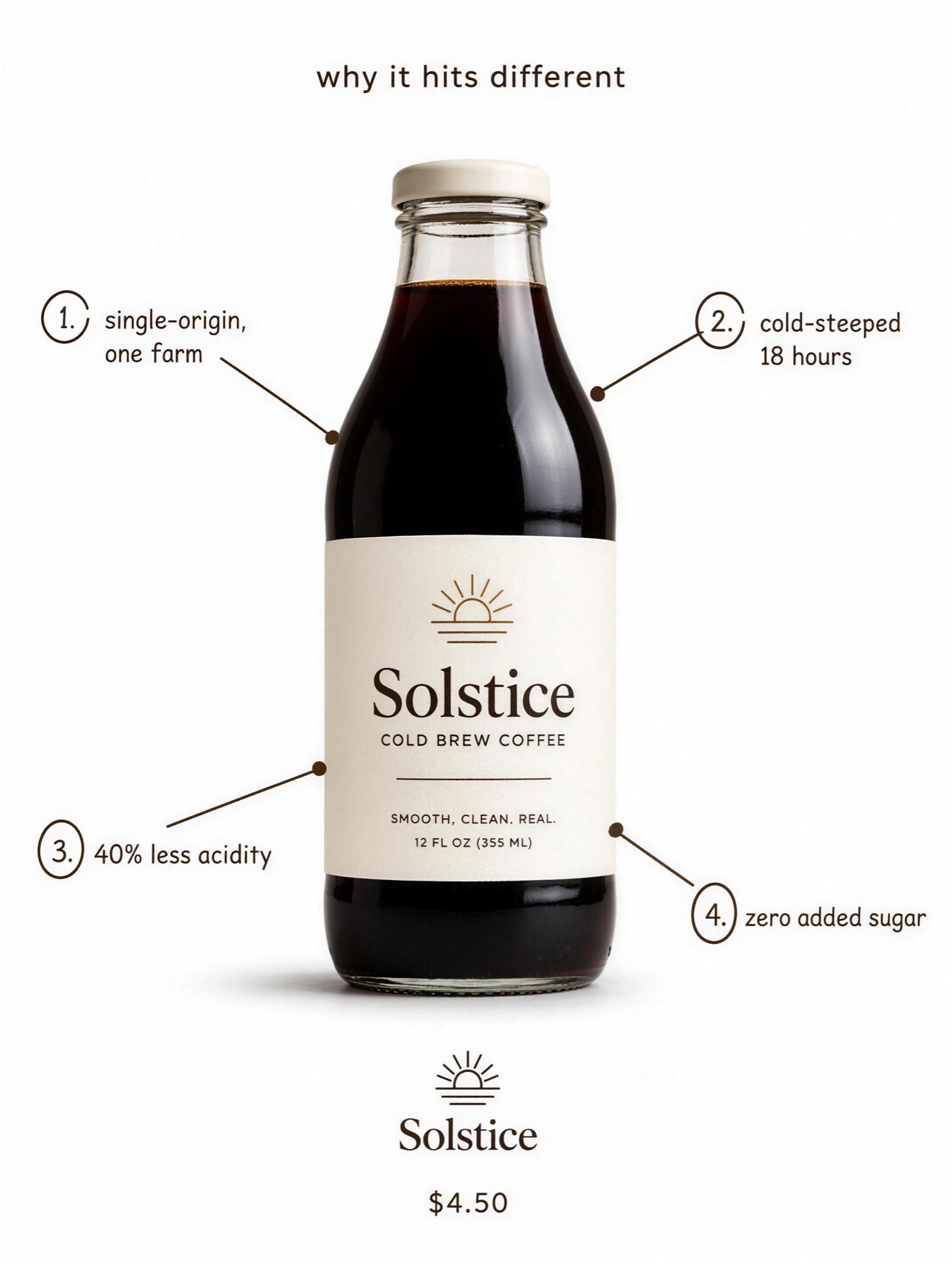
Annotated product with numbered callout lines to each benefit. The food & bev 'why it hits different' explainer.
Native-feel advertorial static, vertical 4:5, built on a photorealistic base: a bright modern kitchen, white cabinets and morning window light, framed slightly wide and softly defocused toward the edges like a casual phone photo. On the counter, crisp and in focus, a family lineup of [PRODUCT — e.g. "Verda, a daily greens powder"]: pouch centered, canister beside it, a filled glass of green water, a small scoop, single-serve sachets fanned in front. OVERLAYS, top to bottom: an elegant editorial serif headline in warm off-white, its last word fully capitalized for intrigue, exactly: "[HEADLINE — e.g. "Why marathoners ditched their vitamin drawer for THIS"]"; beneath it a slim rectangular offer bar in [ACCENT — e.g. "signal green"] whose text carries a visibly struck-through value, exactly: "[OFFER — e.g. "Get Your 79 Dollar Starter Kit Free**"]"; across the lower third a row of five thin white line icons with letterspaced small-caps labels, exactly: "[BENEFITS — e.g. "ENERGY / FOCUS / GUT HEALTH / IMMUNITY / HABIT MADE EASY"]"; at the very bottom a faint footnote, exactly: "[FOOTNOTE — e.g. "**New subscribers only."]". Negative: no people or celebrity likeness, no medical claims beyond the labels given, no logos other than the product's own, icons uniform in stroke weight, all text exactly as quoted, crisp and unwarped.