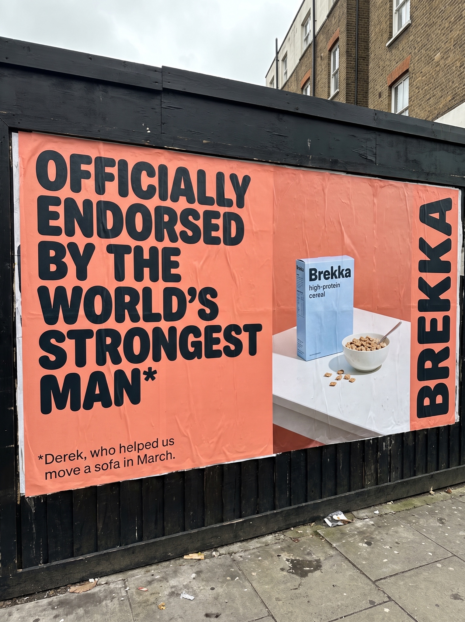
Zero product shots — just a wall of conviction. Type-only posters read like a belief, not an ad, and beliefs stop thumbs.
Vertical 4:5 photograph of a real billboard pasted to a black-slatted hoarding beside a city street, shot slightly from below with a sliver of sky and pavement visible, paper wrinkles and paste seams catching flat daylight. The billboard art itself: a warm flat coral field. Left two-thirds: an enormous headline in chunky rounded near-black grotesk, stacked flush-left on four lines, making a grand famous-sounding endorsement claim that ends with an asterisk, verbatim: "[HEADLINE — e.g. "OFFICIALLY ENDORSED BY THE WORLD'S STRONGEST MAN*"]". Directly beneath, in small quiet type, the footnote that deflates the whole claim, verbatim: "[FOOTNOTE — e.g. "*Derek, who helped us move a sofa in March."]" — the mechanic is grandeur up top, ordinary-person reveal in the fine print. Right third: a simple still life on a white tabletop — [PRODUCT — e.g. "a powder-blue box of Brekka high-protein cereal"] beside a white bowl of it with a few pieces spilled — and the coined brand name running vertically in tall black letters along the right edge. True print color, honest out-of-home context. Every word spelled exactly as quoted, no real celebrity names, no real logos, no extra copy lines, no watermark.