Raw concrete, one hard light, one architectural shadow, one stark line — severity that reads as total confidence in the product.
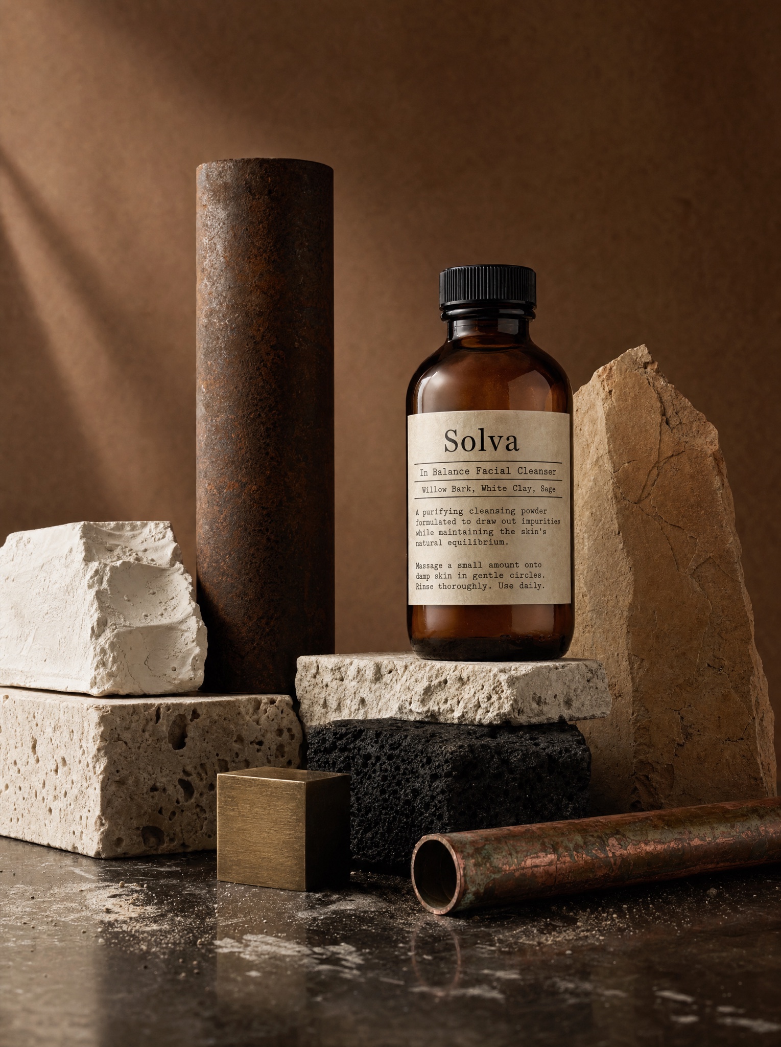
Vertical 4:5 still-life photograph recreating the raw-materials-altar technique of premium apothecary campaigns. Against a warm cocoa-brown seamless backdrop, build a quiet landscape of elemental matter: a pitted travertine block, a rough white plaster slab, a rusted iron cylinder standing like a column, a cracked sandstone shard, a charred black lava brick, a small brushed-brass cube and a length of oxidized copper pipe — every surface tactile and honest, arranged at varied heights with museum restraint. Nested among them at center right, glowing amber against the earth tones, sits [PRODUCT — e.g. "Solva, a charcoal facial cleanser in an amber glass apothecary bottle with a black ribbed cap"]. Its cream paper label is the only text in the image, typeset like a pharmacist's specification sheet — brand name, product line, three ingredient names and two short paragraphs of fine print, all legible: [LABEL TEXT — e.g. "Solva — In Balance Facial Cleanser — Willow Bark, White Clay, Sage"]. Light with one soft directional window source from the left, gentle long shadows, faint dust and powder smudges on the glossy dark floor. Palette strictly earthen: browns, creams, rust, black, amber. No headline, no tagline, no logo lockup — the label carries everything. No cold grey minimalism, no plants or fabric props, no people, no real skincare brands, no watermark.