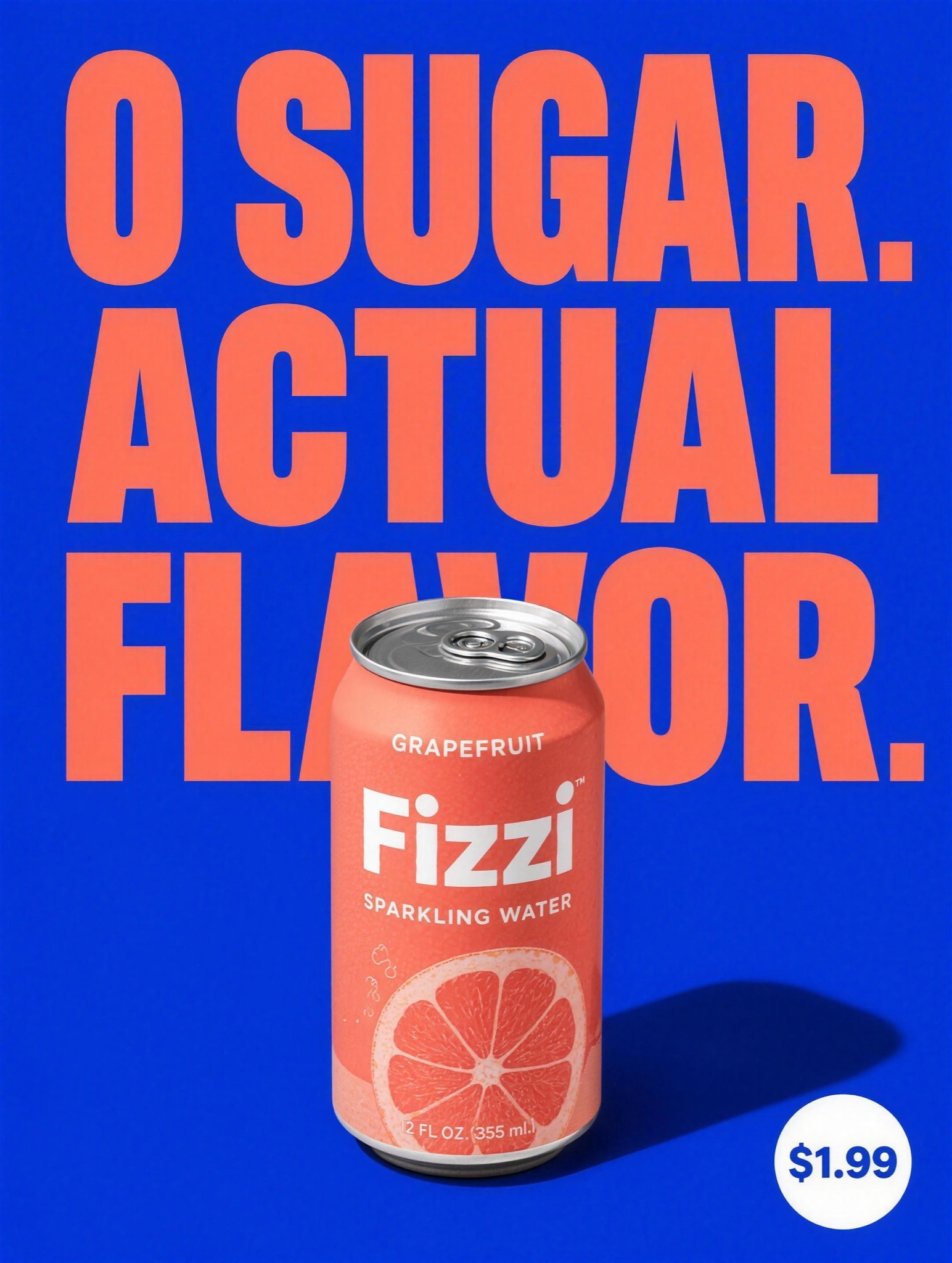
Product, hard shadow, one giant claim, flat color. The modern DTC Meta staple — three elements, zero clutter.
Loud DTC static, vertical 4:5, on a single flat field of saturated [BRAND COLOR — e.g. "fire-engine red"], edge to edge. TOP THIRD, stacked tight and centered: a two-sentence knockout headline in ultra-heavy condensed black caps, the first sentence carrying an asterisk, exactly: "[CLAIM A — e.g. "LESS JUNK.*"]" on line one, "[CLAIM B — e.g. "MORE LOUD."]" on line two; beneath it a white descriptor row split by a thin vertical bar, exactly: "[DESCRIPTOR — e.g. "Cherry Sparkling Water | No Caffeine"]"; then a small availability line in lowercase, exactly: "available at [RETAILER — e.g. "finer corner stores"]". BOTTOM TWO THIRDS: [PRODUCT — e.g. "Morva, a cherry soda-flavored sparkling water in a white can"] rendered enormous, dead center, cropped by the bottom edge of the frame so it feels too big to contain, dense condensation droplets across the whole can, ornate label artwork razor sharp, a thin metallic top rim catching light. FOOTNOTE: one line of vertical micro-type running up the bottom-left edge resolving the asterisk, exactly: "[FOOTNOTE — e.g. "*90% less sugar than the leading cherry soda."]". Negative: no gradients, no shadow behind the can, no additional graphics or props, headline tightly kerned, every character exactly as quoted, crisp and unwarped.