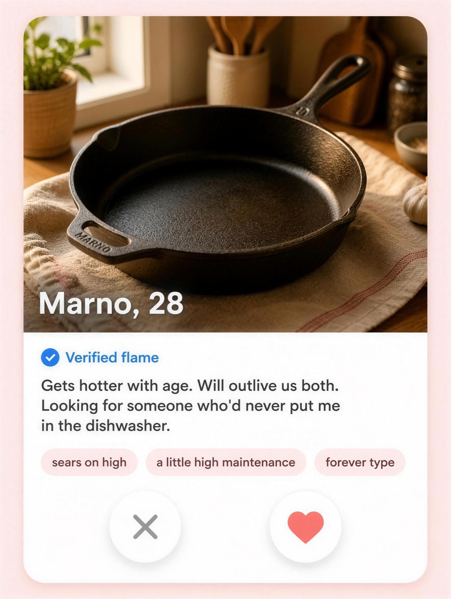
Your product with an age, a bio, and one lovable flaw — the swipe-app frame turns specs into charm.
Vertical 4:5 static styled as a dating-app profile card, rendered as clean flat UI on a soft blush background — no phone bezel. The card is a large rounded rectangle filling most of the frame. Top 60 percent: a warm hero photo of [PRODUCT — e.g. "Marno, a 10-inch cast iron skillet"] shot like a portrait — 85mm look, golden window light, shallow depth of field, resting on a linen-covered kitchen table. Overlaid at the photo's lower left in bold white sans with a soft shadow: [NAME AND AGE — e.g. "Marno, 28"]. Below the photo, on white: a small blue check beside the words "Verified flame", then bio text in dark gray, verbatim: "Gets hotter with age. Will outlive us both. Looking for someone who'd never put me in the dishwasher." Under the bio, three rounded interest chips, verbatim: "sears on high", "a little high maintenance", "forever type". Bottom of the card: two floating circular buttons with soft shadows — a gray X on the left, a coral heart on the right. Typography: friendly geometric sans. All text pin-sharp and exactly as written, no real dating-app logos, no watermark, no extra UI clutter.