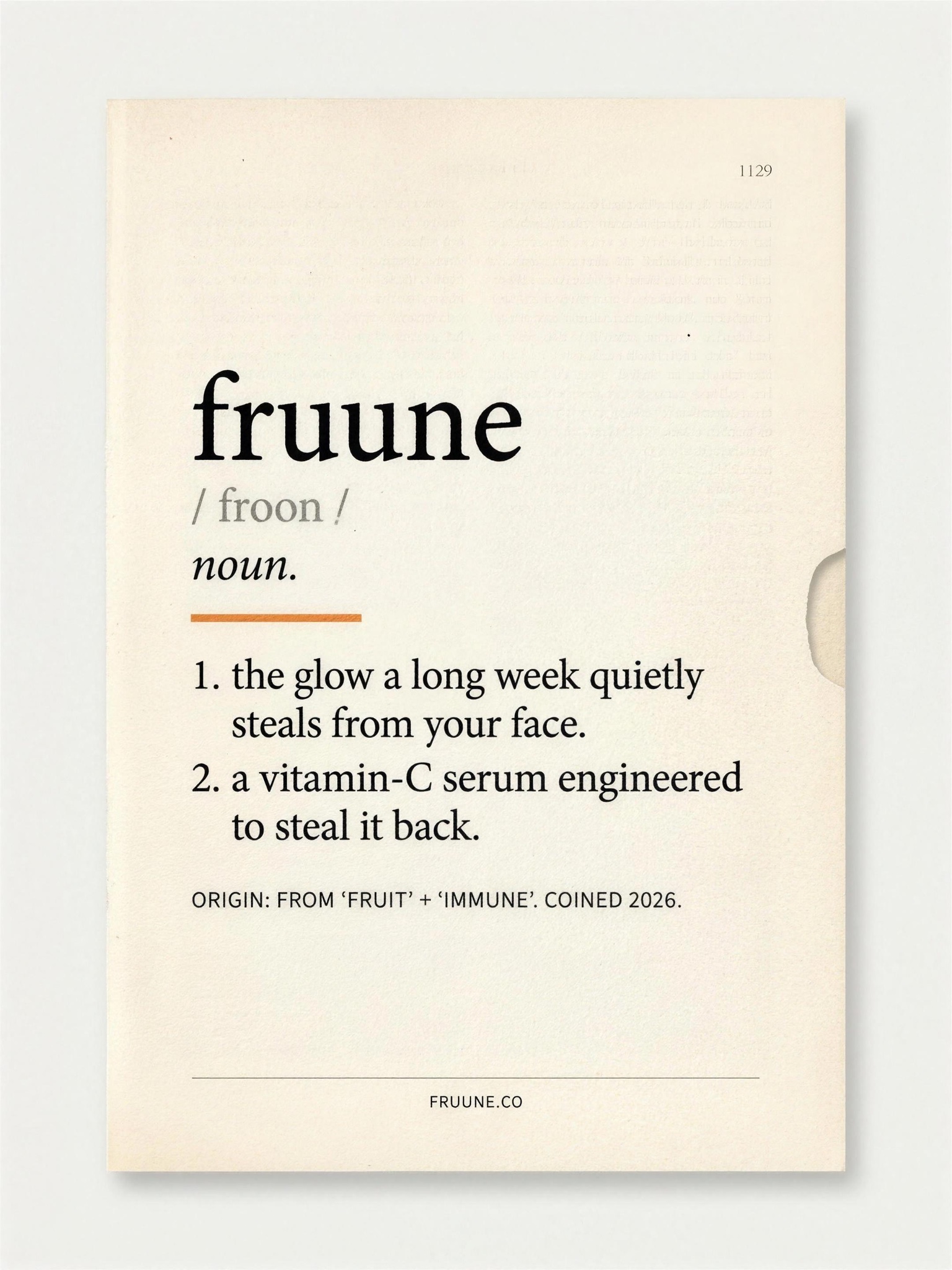
One coined word, defined in serif restraint — the fake etymology carries the joke, the elegance carries the brand.
Vertical 4:5 minimal card on warm cream paper stock with the faint texture of a printed dictionary page, generous margins, centered layout. Upper third: the entry word in large lowercase Caslon-style serif bold, verbatim, with its pronunciation in grey directly beneath: [WORD — e.g. "fruune" with pronunciation "/ froon /"], then the part of speech in italic: "noun." A short clementine-orange underline sits beneath the entry word. Then two numbered definitions in elegant justified serif, rendered verbatim: [DEFINITIONS — e.g. "1. the glow a long week quietly steals from your face." and "2. a vitamin-C serum engineered to steal it back."]. Below, a small-caps etymology line: [ORIGIN — e.g. "ORIGIN: FROM 'FRUIT' + 'IMMUNE'. COINED 2026."]. Near the bottom, a hairline rule, then a tiny centered footer: [FOOTER — e.g. "FRUUNE.CO"]. For realism include a faint page number "1129" in the top right corner and a slim thumb-notch shadow on the right edge. Palette strictly cream, ink black, grey and one clementine accent. All type razor sharp, perfectly kerned and spelled, no warping, no watermark, no imagery beyond typography.