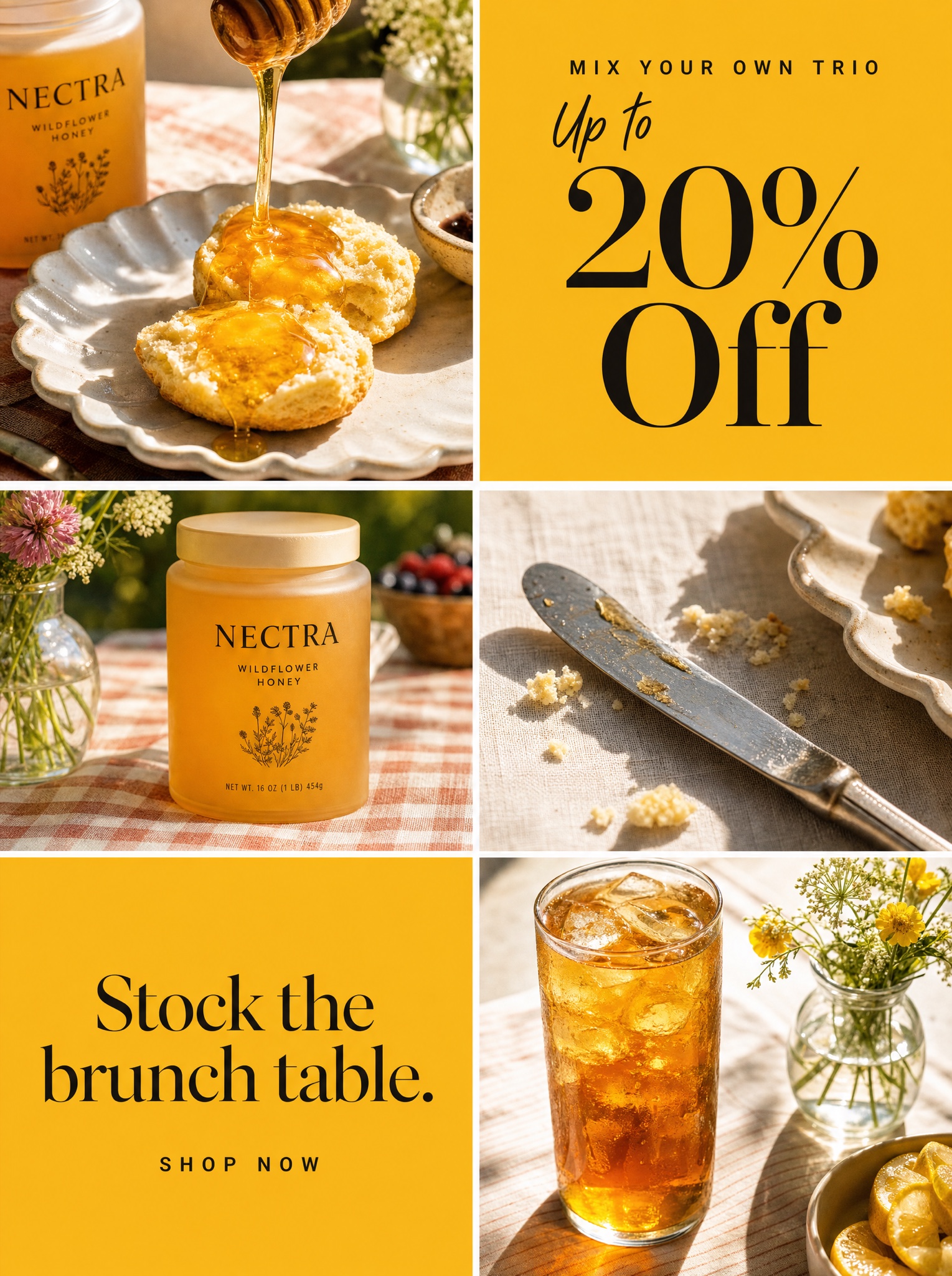
Warm campaign photos and flat offer panels chopped into one magazine grid — reads editorial, sells like a promo.
Vertical 4:5 static ad built as a patchwork magazine grid: six rectangular tiles of varying sizes separated by clean thin white gutters over a pale warm-grey base, outer tiles bleeding off the frame. Four tiles are sun-drenched editorial food photographs of [PRODUCT WORLD — e.g. "Nectra, a wildflower honey in a frosted glass jar"]: a golden ribbon pouring onto split biscuits on a scalloped ceramic plate, the jar standing on a picnic-check tablecloth, a butter knife and crumbs on linen in hard noon shadow, a tall glass of iced tea catching the light. Two tiles are flat [ACCENT COLOR — e.g. "marigold yellow"] type panels. Panel one, stacked and centered in black: a letterspaced caps kicker "[KICKER — e.g. "MIX YOUR OWN TRIO"]", the words "Up to" in casual handwritten script, then "[OFFER — e.g. "20% Off"]" enormous in a high-contrast editorial serif. Panel two: "[SEASONAL LINE — e.g. "Stock the brunch table."]" in the same serif, with "SHOP NOW" beneath in small letterspaced caps. Photography warm and slightly overexposed like a summer cookbook; type panels perfectly flat. Negative: no watermark, no border around the full frame, no tilted gutters, no extra copy, all text crisp and exactly as written.