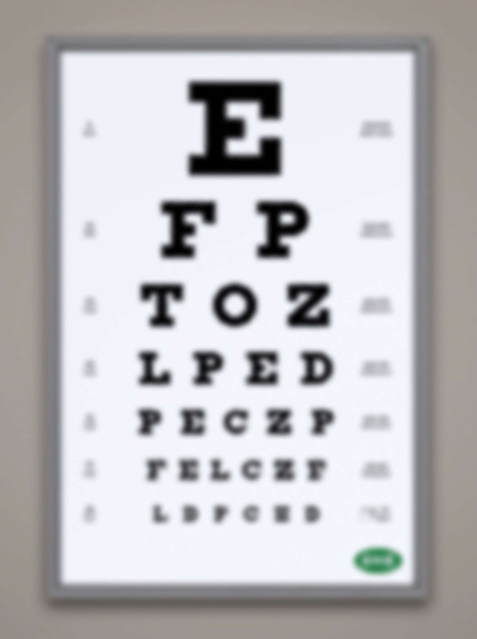
An eye chart whose shrinking rows spell your pitch — readers lean in and squint their way to the CTA.
Vertical 4:5 optometrist eye chart poster, white card with a thin grey border, photographed dead straight on — then the entire image rendered softly out of focus, as if seen by someone who genuinely needs glasses, letters readable only with a squint. That uniform defocus is the whole joke: the ad diagnoses you as you fail to read it. Classic heavy slab optotype letterforms in pure black, rows shrinking line by line, the message deliberately re-chunked so it breaks mid-word, exactly: row 1 "Y", row 2 "OU", row 3 "REY", row 4 "ESNE", row 5 "EDAB", row 6 "REAK", row 7, smallest, "[BRAND — e.g. MILVO]". Read together the rows say your eyes need a break. Faint tumbling-E acuity symbols sit in both side margins, and a tiny rounded green lozenge logo with "[BRAND]" in white sits bottom-right, blurred like everything else. Even letterspacing, perfect centering, correct spelling beneath the blur; the defocus is photographic and uniform, never smeared or doubled. White field, black ink, one green accent. No sharp regions anywhere, no glasses in frame, no wall clutter, no real optician brands, no watermark.