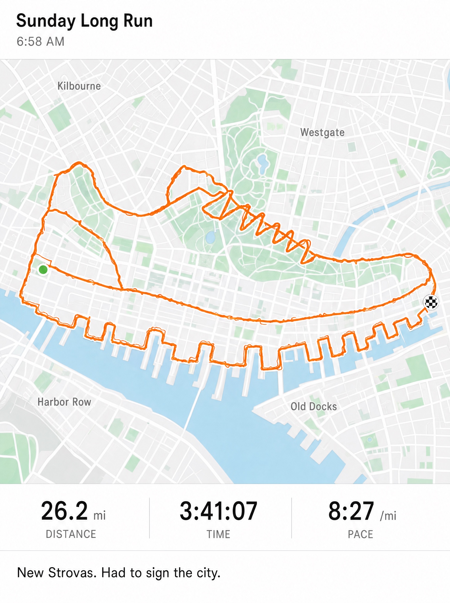
A GPS route that draws your product across the city grid — run-tracker realism turned into route art.
Vertical 4:5 static ad styled as a fitness-app route map — pixel-clean flat UI, no phone bezel, no real app branding. Nearly the whole frame is a pale minimal city map: white and fog-grey streets, mint park blocks, a soft blue river cutting one corner, invented district names scattered naturally in small grey type, exactly: "Kilbourne", "Westgate", "Harbor Row", "Old Docks". Across the entire city runs one continuous recorded GPS route in a thick rounded safety-orange line: it traces [SHAPE — e.g. "the clean side profile of a running sneaker, sole tread drawn by the dock streets, laces zigzagging through the park"], with authentic GPS jitter, small overshoots at corners, a green start dot and a checkered finish dot where the line closes. The drawing must read instantly at arm's length while still following plausible streets. Slim top bar in native app typography: bold activity title "Sunday Long Run", grey subline "6:58 AM". Below the map, a stats row in tabular numerals with tiny grey labels, exactly: "26.2 mi", "3:41:07", "8:27 /mi". One caption line in feed type, exactly: "[CAPTION — e.g. "New shoes. Had to sign the city."]". All text crisp and exactly spelled. No real cities or app logos, no phone frame, no watermark.