Anti-gravity product plus floating ingredients is an instant scroll-stop — weightlessness reads as light, clean, modern.
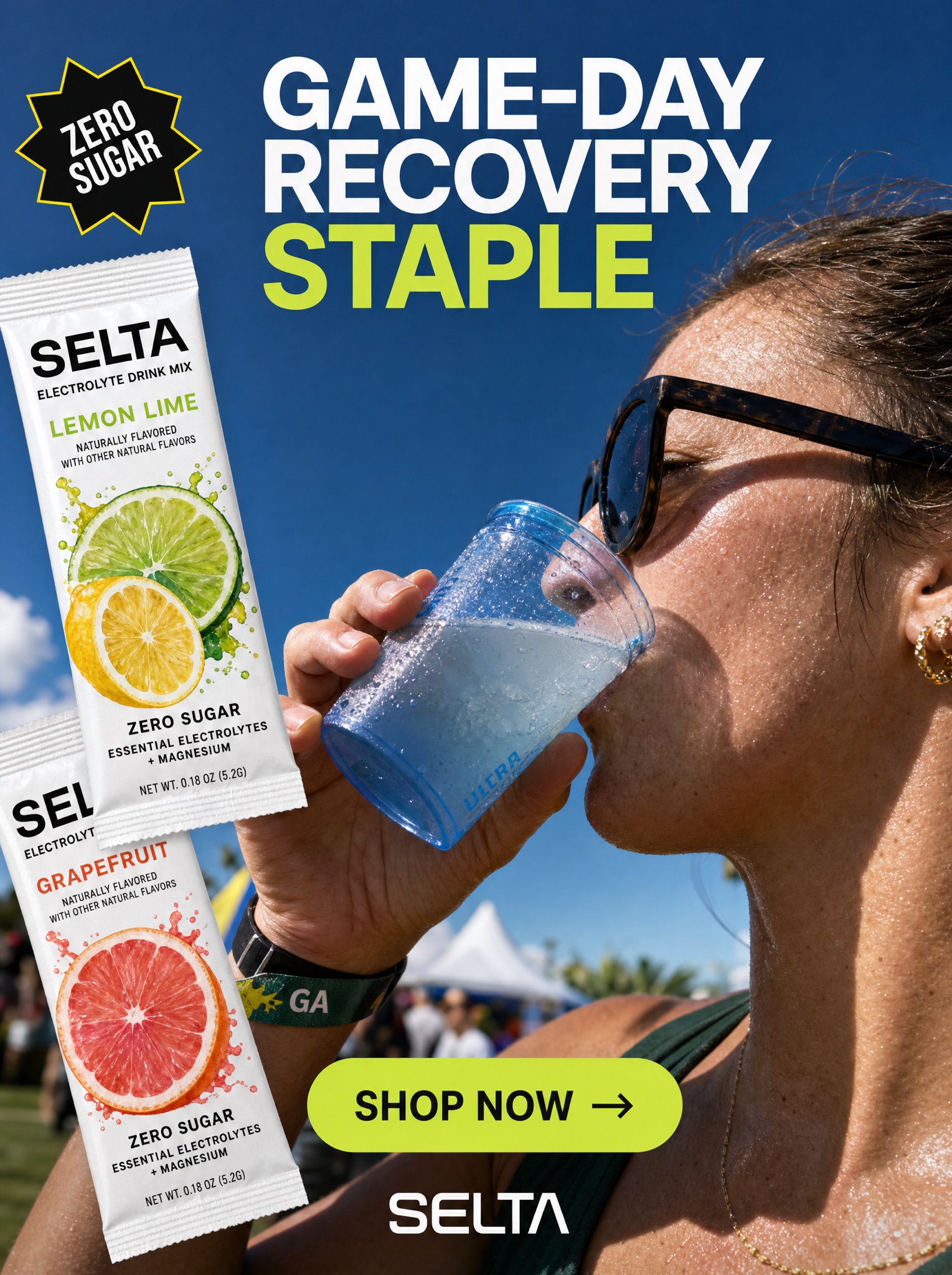
Composited social static, vertical 4:5, layering flat graphics over a real moment. BASE PHOTO: a tight sun-drenched candid of a person mid-drink — profile close-up, harsh true-noon sunlight, deep blue sky, outdoor-event energy — sipping [PREPARED FORM — e.g. "pale electrolyte water"] from a translucent blue cup with condensation and a backlit rim glow, skin texture real and unretouched. COMPOSITE LAYER: two [PRODUCT — e.g. "Selta, an electrolyte drink-mix"] single-serve packets pasted at jaunty overlapping angles along the left edge, front-facing and razor sharp, deliberately crisper than the photo behind them so they read as added later. GRAPHIC LAYER: top center, a two-line all-caps headline in clean white grotesk with the final word switched to [ACCENT — e.g. "lime green"], exactly: "[HEADLINE — e.g. "GAME-DAY RECOVERY STAPLE"]"; upper left, a black starburst-edged sticker badge outlined in yellow, rotated slightly, exactly: "[BADGE — e.g. "ZERO SUGAR"]"; lower center, a rounded [ACCENT] pill button with dark text and a right arrow, exactly: "[CTA — e.g. "SHOP NOW →"]"; beneath it a small centered logotype, exactly: "[BRAND — e.g. "SELTA"]". The charm is honest collage — the photo feels found, the graphics feel applied. Negative: no studio look, no levitating props, no extra badges, packets unwarped and legible, every quoted word exact and crisp.