Your ingredient list drawn as chemistry — molecules and lab type make 'clean formula' visible instead of claimed.
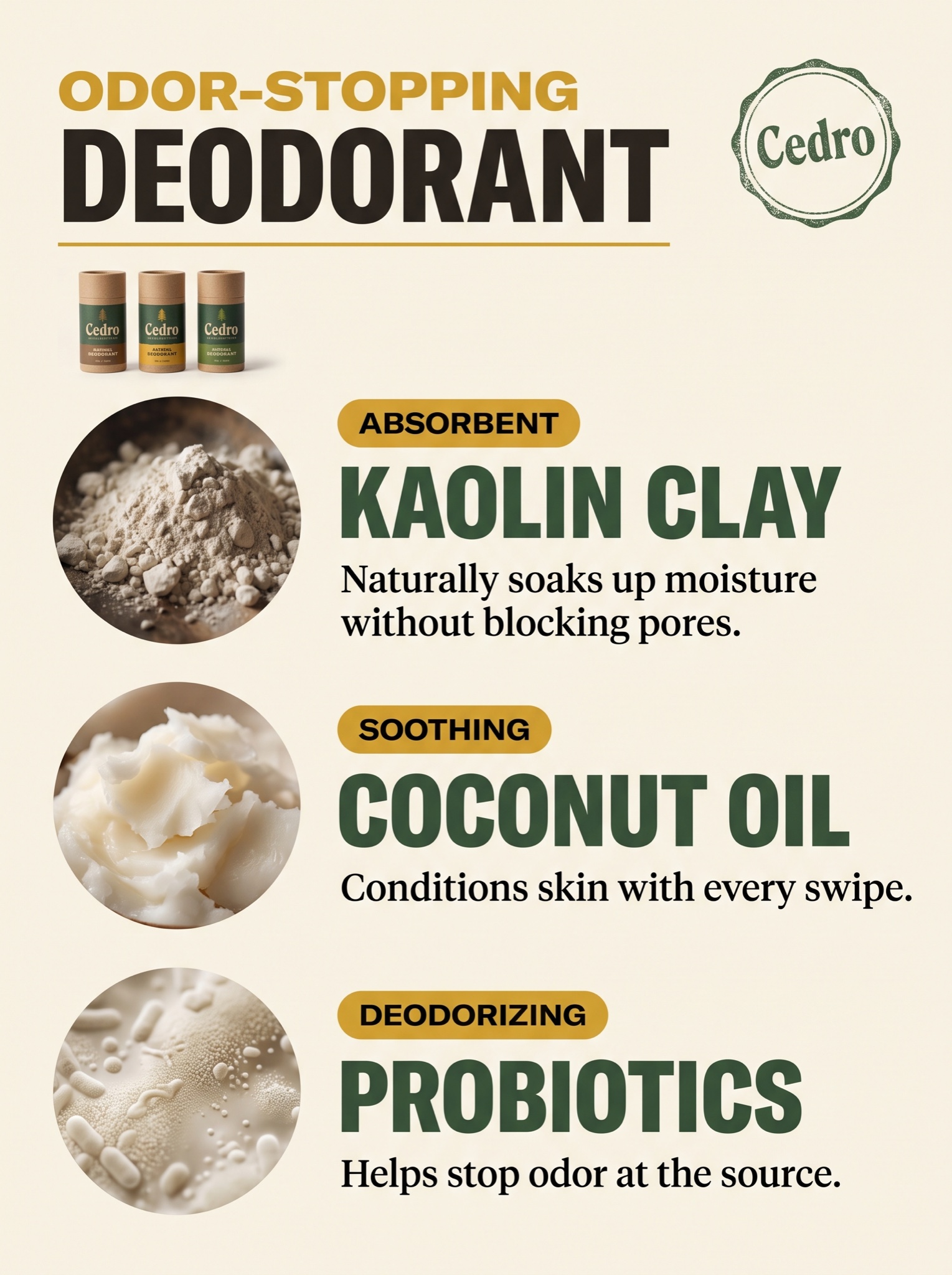
Vertical 4:5 ingredient-breakdown infographic in a rustic natural-goods style on a flat warm cream background. Header, top left: a mustard-yellow eyebrow line in bold caps, "[EYEBROW — e.g. "ODOR-STOPPING"]", above the product type in huge dark slab capitals: "[TITLE — e.g. "DEODORANT"]", with a thin rule beneath. Top right: a simple round stamped crest badge carrying the coined wordmark "[BRAND — e.g. "Cedro"]". Upper left under the header: a small photo of three [PRODUCT — e.g. "Cedro natural deodorant sticks in kraft-toned tubes"] standing in a row. Main body: three identical stacked rows, each built the same way — a circular macro photograph of the raw ingredient on the left with moody natural lighting, and to its right a small mustard pill-shaped tag in caps ("[TAG 1 — e.g. "ABSORBENT"]" / "[TAG 2 — e.g. "SOOTHING"]" / "[TAG 3 — e.g. "DEODORIZING"]"), a big forest-green ingredient name in bold caps ("[ING 1 — e.g. "KAOLIN CLAY"]" / "[ING 2 — e.g. "COCONUT OIL"]" / "[ING 3 — e.g. "PROBIOTICS"]"), then one plain-spoken benefit sentence in black serif, verbatim: [BENEFITS — one short sentence per ingredient]. Palette strictly cream, forest green, mustard, black. All text crisp and correctly spelled, no mascots or cartoon characters, no watermark, no extra rows.