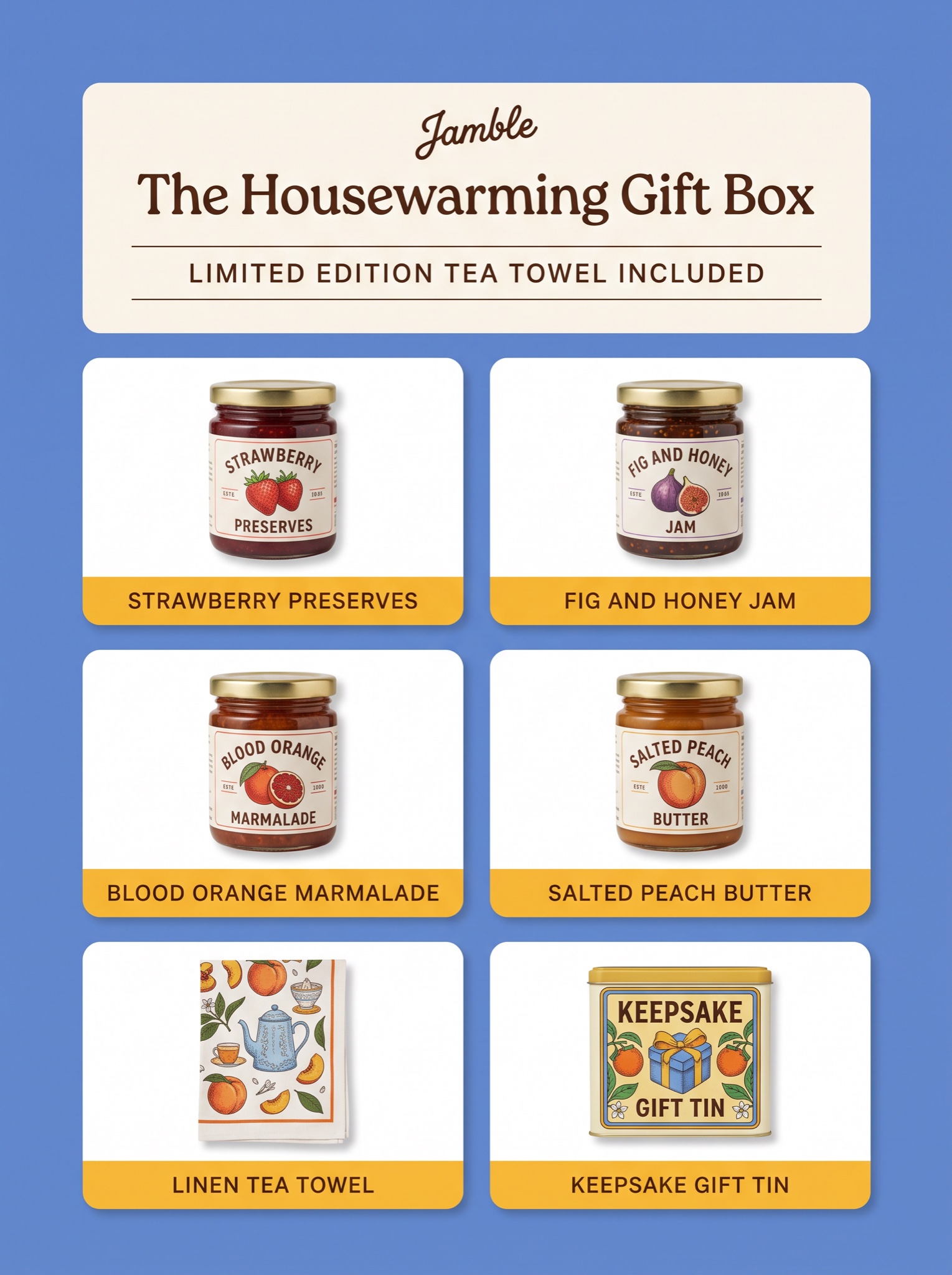
Lays the whole bundle out as a labeled specimen grid — shoppers do the value math before they read a word of copy.
Vertical 4:5 static ad on a flat [BACKGROUND COLOR — e.g. "cornflower blue"] field, laid out as a tidy contents-manifest grid. Top block, all centered in warm off-white: a small hand-lettered script wordmark "[BRAND — e.g. "Jamble"]", then a headline in a friendly rounded serif "[HEADLINE — e.g. "The Housewarming Gift Box"]", then a thin rule, a letterspaced all-caps subline "[BONUS LINE — e.g. "LIMITED EDITION TEA TOWEL INCLUDED"]", and a second thin rule. Below, a 2-column by 3-row grid of white rounded-corner tiles with even gutters. Each tile holds one item from the bundle photographed straight-on with a whisper of drop shadow, plus a [LABEL COLOR — e.g. "marigold yellow"] label strip across the tile's bottom edge carrying the item name in small dark-brown caps: "[ITEM 1 — e.g. "Strawberry Preserves"]", "[ITEM 2 — e.g. "Fig and Honey Jam"]", "[ITEM 3 — e.g. "Blood Orange Marmalade"]", "[ITEM 4 — e.g. "Salted Peach Butter"]", "[ITEM 5 — e.g. "Linen Tea Towel"]", "[ITEM 6 — e.g. "Keepsake Gift Tin"]". Packaging is colorful vintage-illustrated so the six tiles read like a curio cabinet. Negative: no watermark, no real retailer logos, no crooked grid lines, no duplicated items, every label spelled exactly as written.