A dropped pin and one unhinged five-star local review — borrowed maps-app trust for whatever you're selling.
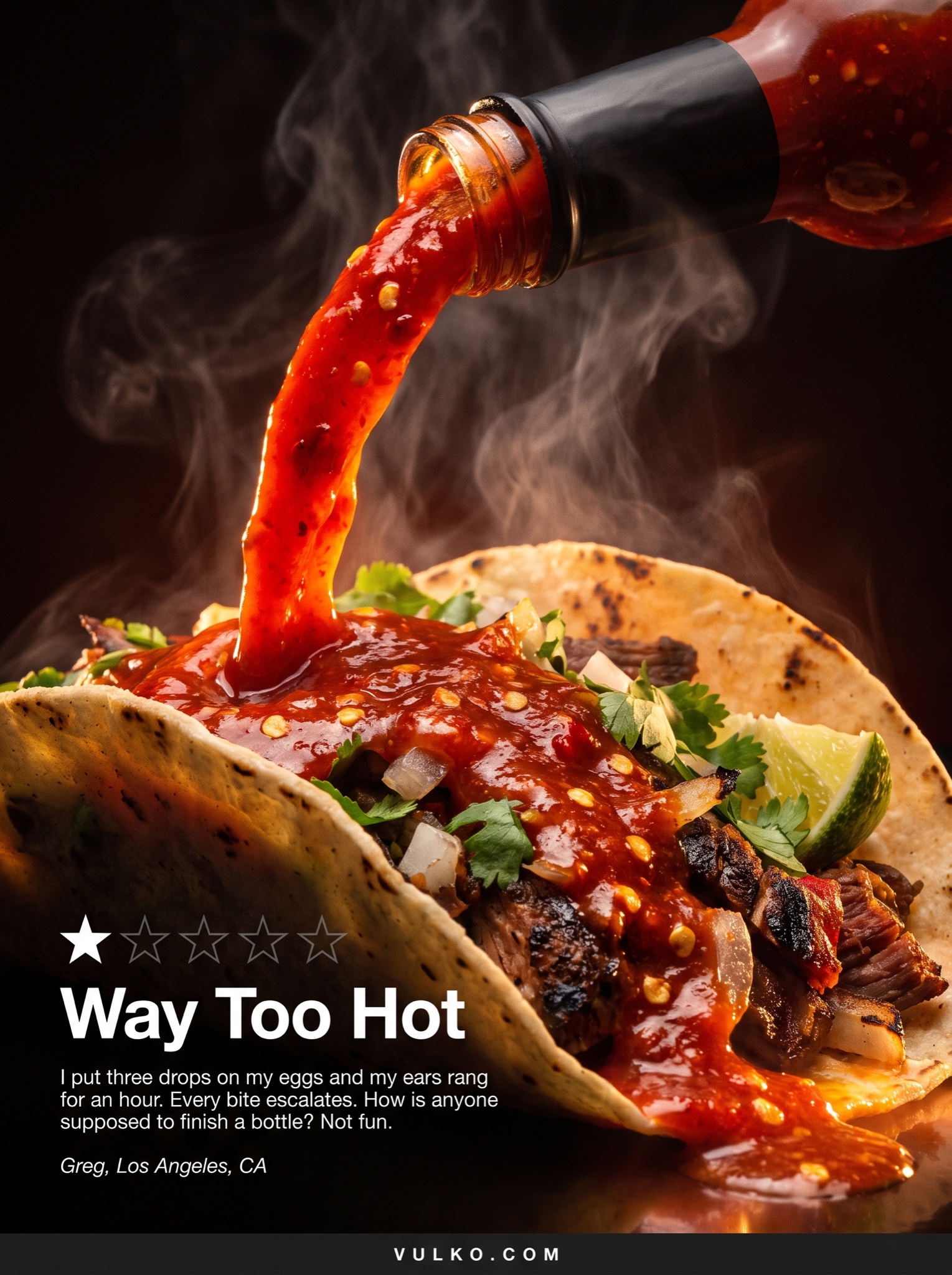
Vertical 4:5 full-bleed print-style ad built on one epic photograph with a one-star review as the headline — the complaint does the selling. The photo: a cinematic macro action shot of [PRODUCT — e.g. "a habanero hot sauce"] mid-pour, a molten red ribbon arcing onto a loaded taco, steam rising, seeds suspended in the splash, lit like a volcano documentary against deep shadow, heroic scale, glistening texture. Overlaid lower-left in clean white magazine typography: a row of five stars with only the first star filled, the other four thin grey outlines; beneath it a bold headline, exactly: "Way Too Hot"; then a short earnest complaint paragraph in small white type, exactly: "I put three drops on my eggs and my ears rang for an hour. Every bite escalates. How is anyone supposed to finish a bottle? Not fun."; then an italic attribution, exactly: "Greg, Los Angeles, CA". Bottom edge: a thin footer strip with "[BRAND URL — e.g. "VULKO.COM"]" in small letterspaced white caps. The technique is the tension: luxurious photography agreeing enthusiastically with a bad review, no rebuttal anywhere. Text block kept small so the image breathes; all type crisp and exactly spelled. No five-star ratings, no reply copy, no real sauce brands or resorts, no watermark.