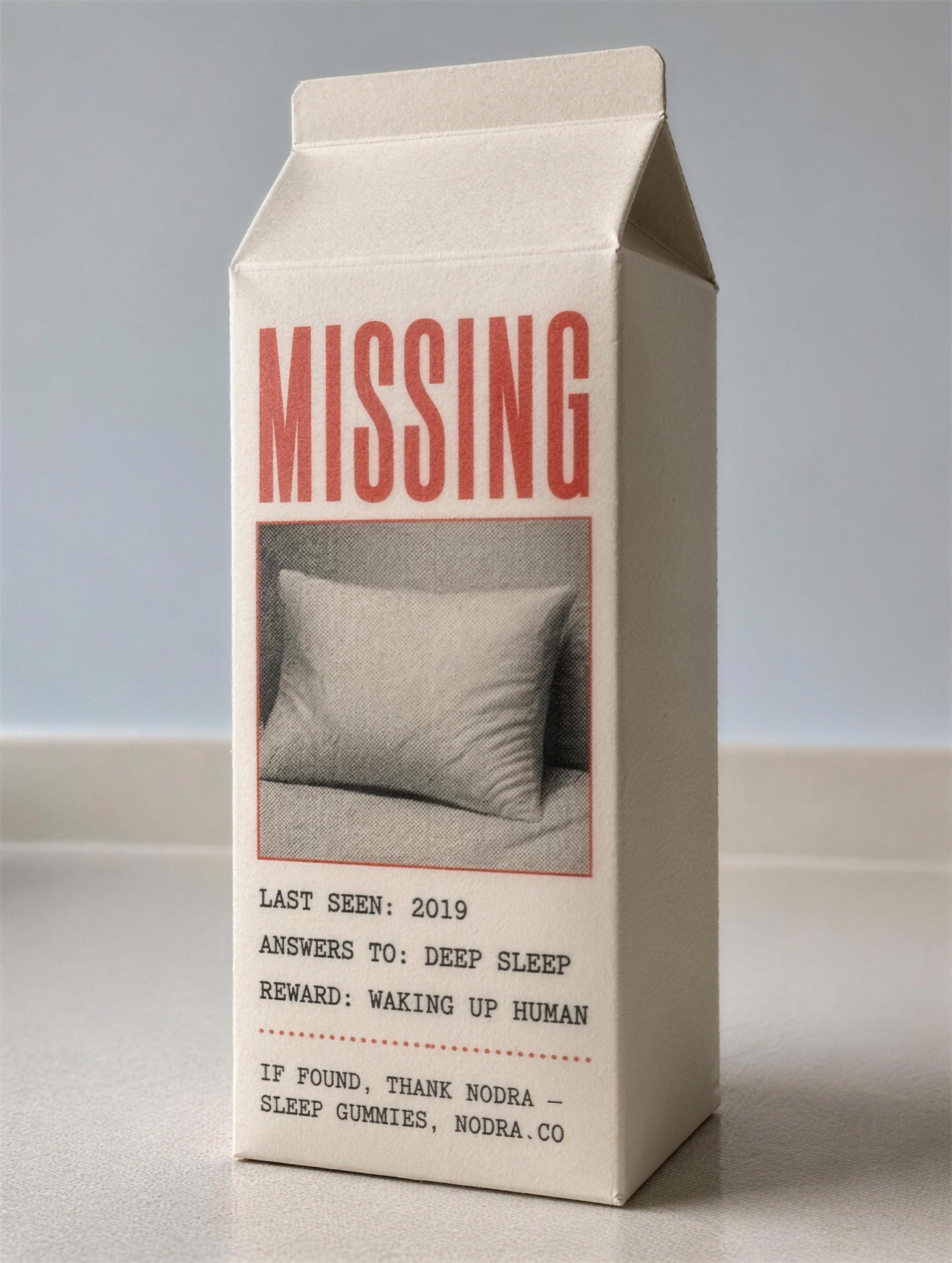
Print's saddest format, weaponized: 'MISSING: your deep sleep' gets read top to bottom every single time.
Vertical 4:5 photograph of a single paper milk carton standing on a plain kitchen counter in flat morning light, shallow depth of field, pale blue-grey wall behind. The carton's front panel is printed in flat two-color retro offset style — black plus faded red — as a classic missing-notice parody. Panel text rendered verbatim, top to bottom: "MISSING" in tall condensed caps, then a thin-framed photo box containing [MISSING IMAGE — e.g. "a rumpled empty pillow, printed in grainy halftone"], then details in typewriter-style lines: [DETAILS — e.g. "LAST SEEN: 2019", "ANSWERS TO: DEEP SLEEP", "REWARD: WAKING UP HUMAN"]. Beneath a dotted rule, small print reads [BRAND LINE — e.g. "IF FOUND, THANK NODRA — SLEEP GUMMIES, NODRA.CO"]. Keep the printed design flat and offset-like while the carton itself stays photoreal: soft paper creases, gable top, believable seams and fold lines. Nothing else on the counter. All panel text sits straight and follows the carton's perspective, perfectly spelled; no real dairy branding, no barcode clutter, no watermark.