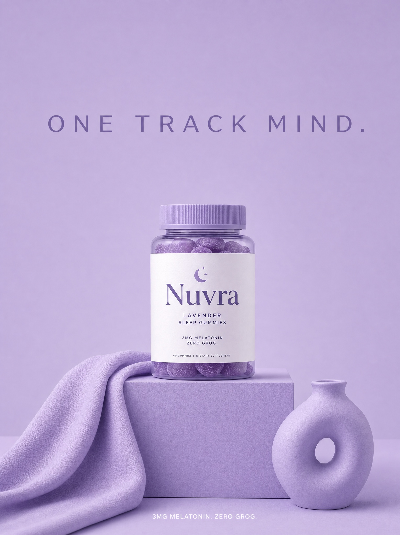
One hue floor-to-ceiling burns the brand color into memory — the label is the only thing allowed to break it.
Vertical 4:5 color-drenched studio still life. Every element in frame shares one hue: [BRAND COLOR — e.g. "soft lilac, hex B9A7E6"] — seamless backdrop, floor, a low display cube, a draped cloth, a small ceramic prop, all painted or dyed in that single color so only light and shadow separate them tonally. Centered on the cube sits [PRODUCT — e.g. "Nuvra, a jar of lavender sleep gummies with a clean white label"] — the label is the only non-matching element in the image and pops instantly. Soft wraparound light from two large frontal softboxes keeps shadows pale and tonal; 70mm lens look, f/9, everything sharp. Calm, symmetrical composition with generous negative space above the product. In that space set the headline "[HEADLINE — e.g. "ONE TRACK MIND."]" in a wide-tracked elegant sans, in the same hue pushed two shades darker. Bottom center, tiny white type: "[SUBLINE — e.g. "3MG MELATONIN. ZERO GROG."]". Monochrome discipline is the entire idea: if any prop drifts off-palette the ad fails. No watermark, no stray off-palette colors, no gradients into other hues, no hands, no warped or misspelled text.