Your product on a plinth with a straight-faced gallery label. Deadpan prestige makes people read every word.
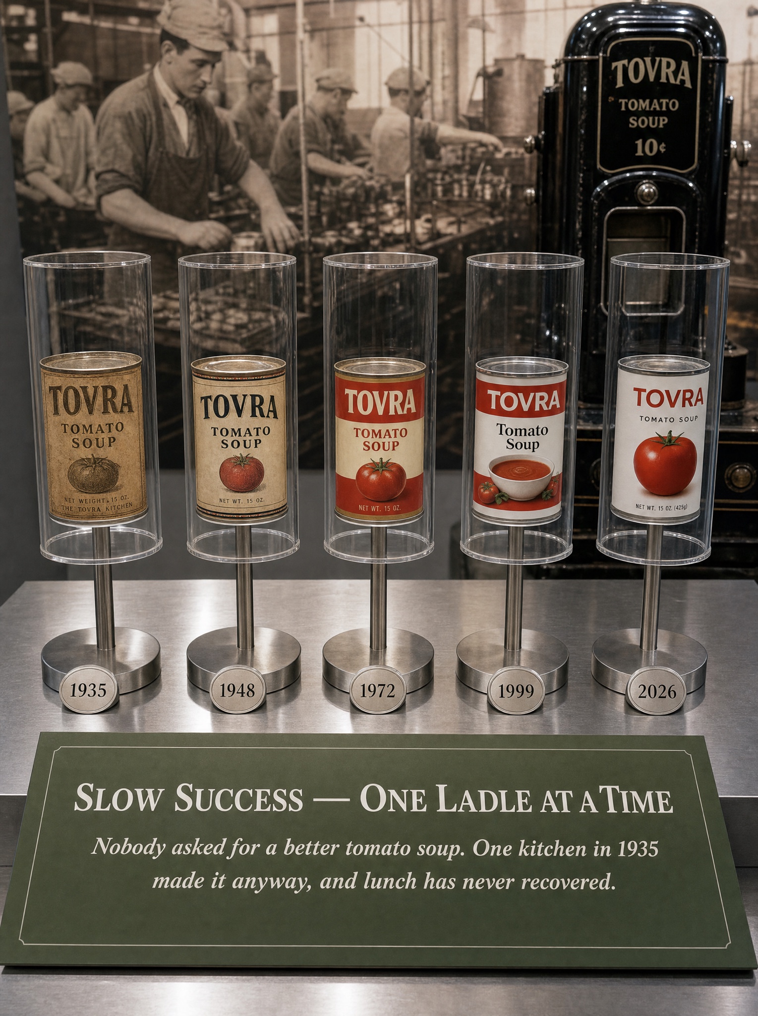
Vertical 4:5 photograph of a museum vitrine documenting one product's history like national heritage. On a brushed-steel display table: five package generations of [PRODUCT — e.g. "canned tomato soup"] presented in a row, each mounted alone atop a slim steel post inside its own clear acrylic cylinder, each base carrying a small engraved year medallion, exactly: "1935", "1948", "1972", "1999", "2026" — the label design aging believably from ochre paper and engraved lettering to modern print. Behind them, softly out of focus: a sepia photomural of factory workers and a black enamel vintage dispensing machine. Across the lower foreground, angled toward the viewer like real interpretive signage: a moss-green panel printed with a white serif headline, exactly "SLOW SUCCESS — ONE LADLE AT A TIME", and beneath it an italic curatorial lede, exactly: "Nobody asked for a better tomato soup. One kitchen in 1935 made it anyway, and lunch has never recovered." Museum lighting: cool even wash, gentle reflections curving on the acrylic, dust-free stillness, shot at eye level like archival documentation. All signage text crisp and exactly spelled. No real museums or food trademarks, no visitors, no velvet ropes, no watermark.