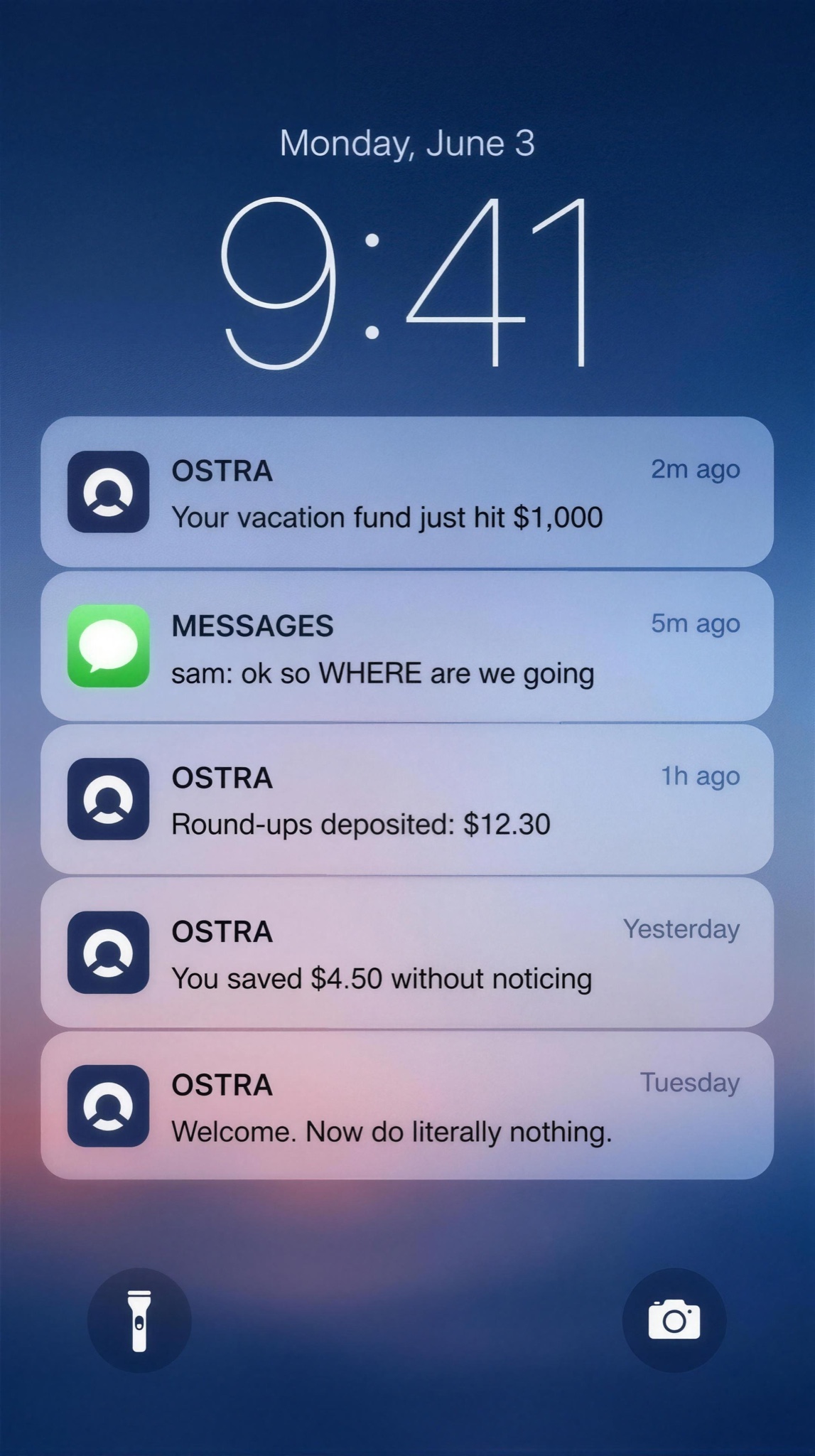
Five lockscreen pushes read like a short story — the newest notification is the payoff and the pitch.
Vertical 9:16 static styled as a phone lockscreen, rendered as flat pixel-perfect UI — no bezel, no hand, no photographed screen. Background: a softly blurred dusk-blue gradient wallpaper. Upper third: a large thin-weight clock reading "9:41" with "Monday, June 3" in small type above it. Below, a stack of five rounded frosted-glass notification cards, newest on top, each with a tiny app icon, app name in caps, timestamp, and one message line. Verbatim, top to bottom: [APP NAME — e.g. "OSTRA"] "2m ago — Your vacation fund just hit $1,000 🎉"; "MESSAGES • 5m ago — sam: ok so WHERE are we going"; [APP NAME] "1h ago — Round-ups deposited: $12.30"; [APP NAME] "Yesterday — You saved $4.50 without noticing"; [APP NAME] "Tuesday — Welcome. Now do literally nothing." The five cards should read downward as a story in reverse. Frosted cards have realistic background blur, hairline separators and native system sans type. Small flashlight and camera glyphs sit in the bottom corners. All text crisp and exactly spelled, consistent icon design across cards, no real app logos, no watermark, no warped emoji.