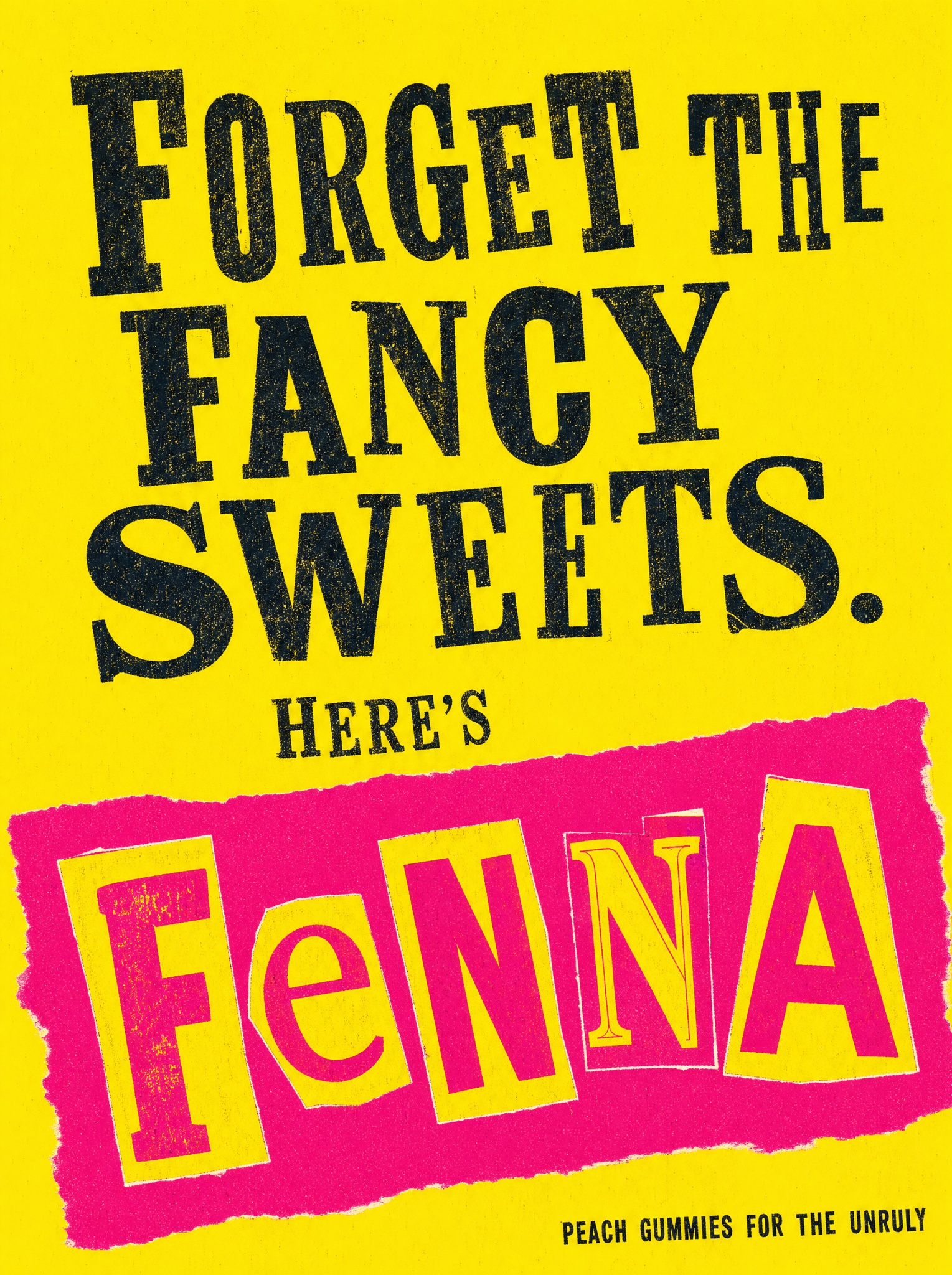
Cut-out magazine letters make a playful demand for the product — chaotic craft energy that reads instantly as a joke, not a threat.
Vertical 4:5 poster recreating the punk cut-and-paste record-sleeve technique — flat graphic design, not a photograph. Background: one solid slab of loud chrome yellow, edge to edge, with the faint tooth of cheap screen-printed paper. Top half: a dismissive headline in black stamped serif capitals, letters deliberately mismatched in width and weight, baselines drifting, ink slightly mottled as if rubber-stamped by hand, on two ragged lines: [LINE ONE — e.g. "FORGET THE FANCY SWEETS."]. Below it, much smaller in the same stamped treatment: [LINE TWO — e.g. "HERE'S"]. Bottom half: a hot-magenta banner shape with roughly torn ends, rotated about eight degrees, slapped across the full width; inside it the brand name spelled in ransom-note cut-out letters — every character clipped from a different imaginary magazine, wildly mixed sizes, cases and typefaces, pasted unevenly with tiny white cut edges showing: [BANNER WORD — e.g. "FENNA"]. In the bottom corner, one tiny stamped line: [TAG — e.g. "PEACH GUMMIES FOR THE UNRULY"]. Three colors only — yellow field, black stamps, magenta banner with yellow cut-out letters. Slight print misregistration throughout. The energy is cheerful vandalism, never threat. No photography, no product shot, no weapons or menace, no real band or record references, no clean digital kerning, no watermark, every letter the correct letter and fully legible.