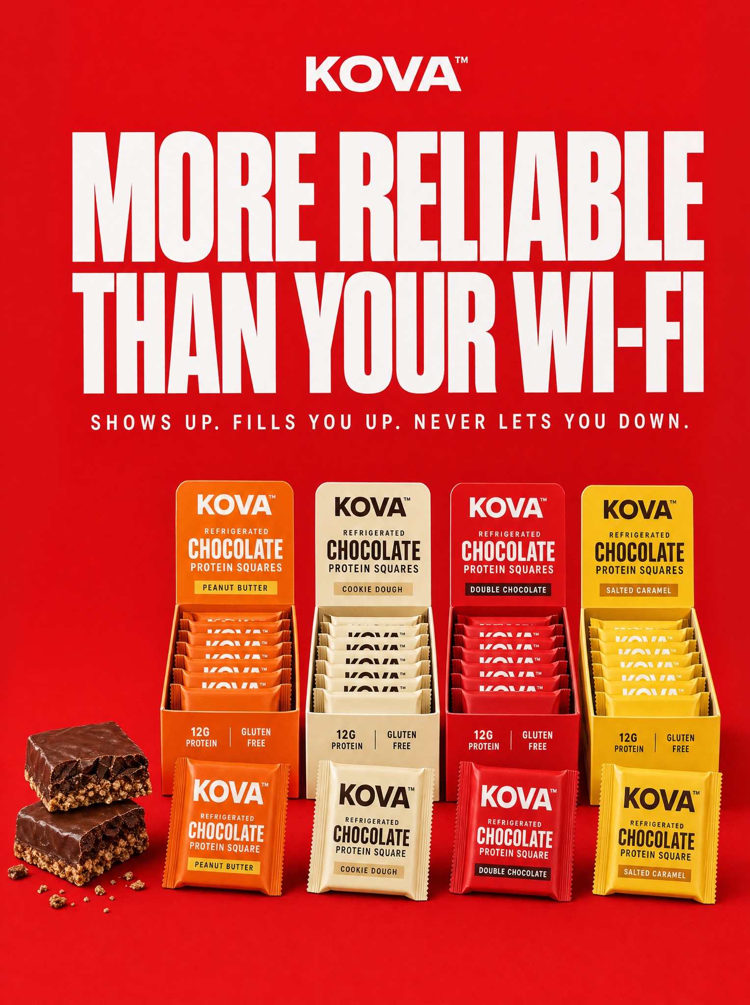
One flat brand color, one roast headline, and a checkout-tray lineup that makes a snack look like it already won retail.
Vertical 4:5 static ad on a flat, seamless signal-red background — one solid brand color, no gradient. Top: a small brand wordmark in white caps with a trademark symbol: [BRAND — e.g. "KOVA™"]. Below it, a giant two-line roast headline in extra-bold white grotesk caps with tight tracking, reading exactly "MORE RELIABLE THAN YOUR WI-FI". Under the headline, one thin letterspaced support line of three staccato sentences in small white caps: "SHOWS UP. FILLS YOU UP. NEVER LETS YOU DOWN." Bottom third: a retail checkout lineup — four open cardboard display trays standing side by side, each in a different flavor colorway (orange, cream, red, yellow), filled with neat rows of wrapped [PRODUCT — e.g. "Kova, refrigerated chocolate protein squares"], with two single wrapped squares leaning against the front of the trays. Far left, two unwrapped squares stacked and broken open to show a fudgy chocolate top over a crunchy base, a few crumbs scattered. Soft, even studio light with short drop shadows grounding everything on the red. The whole ad reads as flat graphic design holding one photographic product row. All text crisp, unwarped, exactly as written. Negative: no watermark, no gradient, no lifestyle scene, no hands, no extra badges, no competitor names.