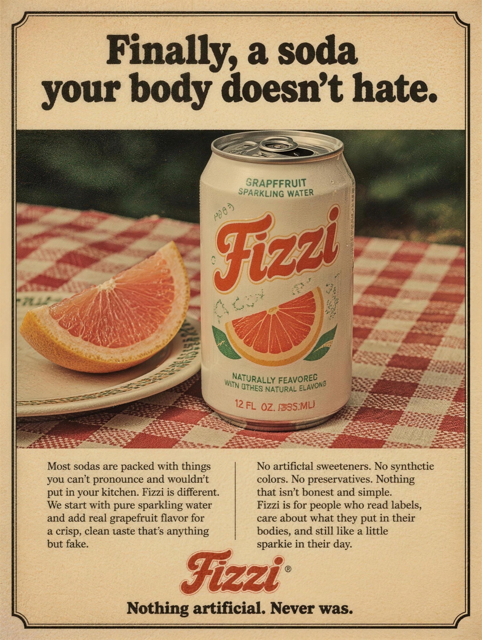
A 70s magazine ad for your modern product — chunky serif, halftone grain, earnest copy. Reads premium-indie.
Turn-of-the-century chromolithograph advertisement, vertical 4:5, in the painted trade-poster manner of 1900: rich saturated stone-litho inks, softly idealized painterly realism, aged paper warmth at the edges. SCENE: an elegant society woman in an enormous white ostrich-feather hat, lace-trimmed gown and long white gloves, seated at a marble ledge before a deep purple damask drape, raising a small etched glass of [PRODUCT — e.g. "Delva, a sparkling botanical tonic"] toward the viewer with a knowing half-smile; yellow roses in an amber glass vase at right, a palm frond entering from the left edge. ON THE LEDGE: an ornate gilt easel holds an oval cameo sign with gold filigree border, lettered in period show-card style — an imperative word in gold caps, the brand in flowing red script, the price small in yellow beneath, exactly: "[SIGN — e.g. "SIP" / "Delva" / "5¢"]". Beside it lies a casually dropped calling card in copperplate handwriting, exactly: "[CARD — e.g. "Delva Bottling Co. — Branches: Chicago, Los Angeles, Dallas"]". Negative: no photographic rendering, no modern typefaces, no halftone dots, no extra signage; gloved hands anatomically correct, all lettering exactly as quoted, legible and unwarped.