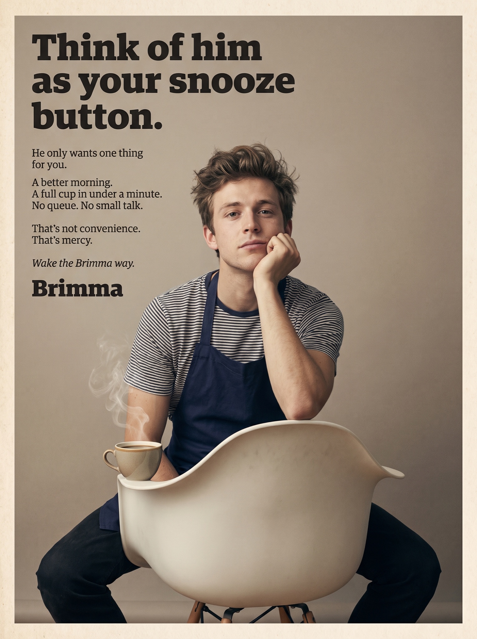
Vast white space, one wry line, three columns of smart serif copy — the '60s ad-revolution look flatters the reader.
Vertical 4:5 magazine advertisement in the late-1960s creative-revolution style: one photograph, one provocation, staccato copy. The photo: a muted-color studio portrait against a plain warm-grey sweep — [SUBJECT — e.g. "a young barista in a navy apron sitting backwards on a white molded chair, chin resting on one hand, gazing evenly at the camera, a steaming cup of Brimma instant coffee on the chair arm"] — honest editorial lighting of the era, soft photographic grain, natural and unretouched. Top left, over the empty grey, the headline in heavy black slab-serif sentence case on two lines, ending with a period, verbatim: "[HEADLINE — e.g. "Think of him as your snooze button."]" — the mechanic is a startling reframe of what the customer is really buying. Beneath it, one narrow ragged-right column of small serif copy where every sentence sits on its own line, verbatim: [BODY LINES — e.g. "He only wants one thing for you." / "A better morning." / "A full cup in under a minute." / "No queue. No small talk." / "That's not convenience. That's mercy."]. The column closes with an italic kicker, "[KICKER — e.g. "Wake the Brimma way."]", and the brand beneath in bold serif: "[BRAND — e.g. "Brimma"]". Period typesetting, generous leading, muted true-to-era color only. No loud saturation, no starbursts, no modern fonts, no watermark, every quoted word exact.