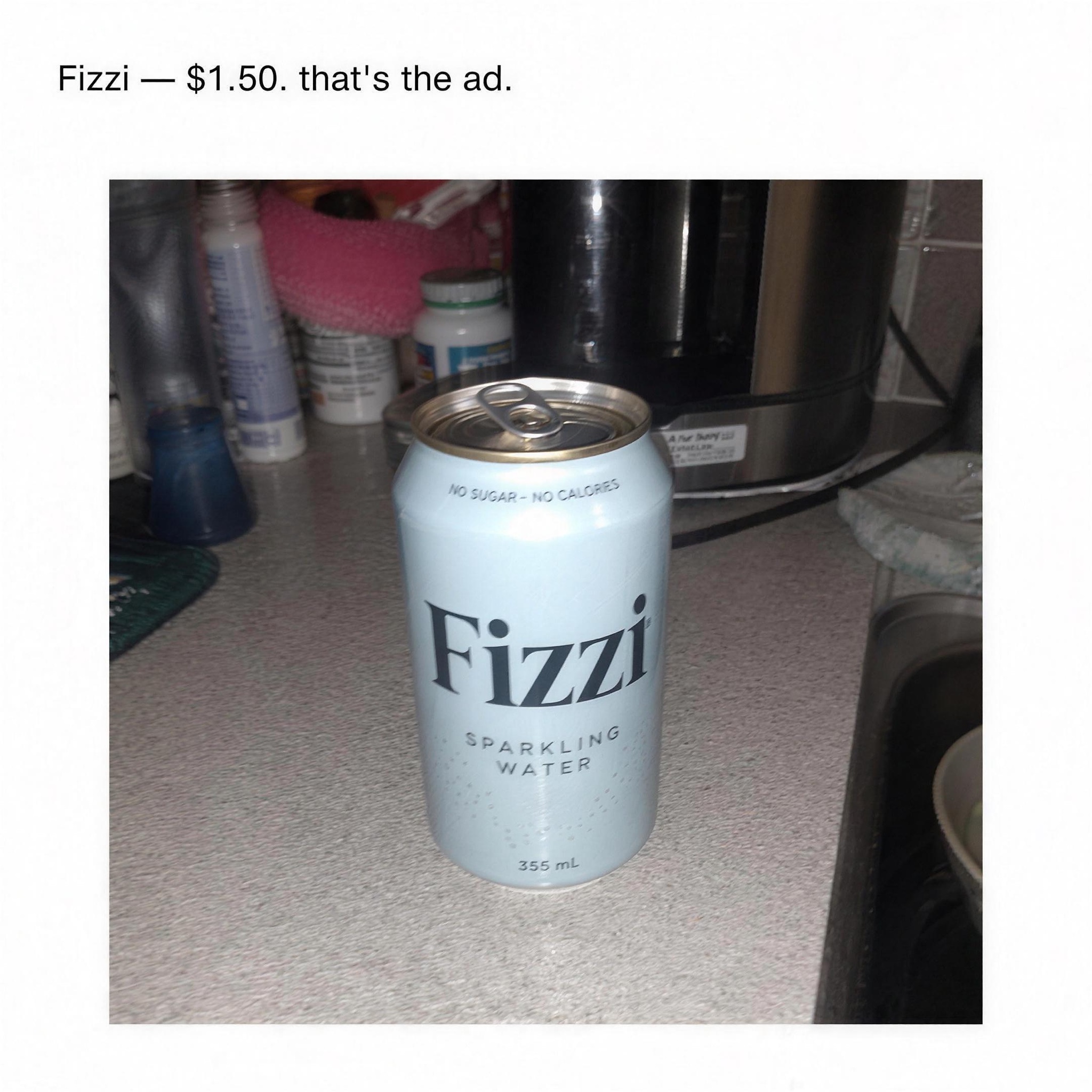
Deliberately amateur — bad crop, harsh flash, Comic-Sans energy. Slips past ad-blindness because it looks like a marketplace post.
Flat graphic poster, vertical 4:5, deliberately unpolished DIY craft in the anti-design oat-era print tradition. Background: one solid flat wash of pale sky blue, edge to edge, faintly uneven like screen-printed ink. Top half: a giant imperative headline hand-painted in chunky blocky capitals, white letterfaces with a hard black offset drop shadow, wobbly enough to read as human-made, exactly: "[COMMAND — e.g. "SEARCH OAT COLD BREW"]". Directly below, the term being searched sits inside a hand-drawn white rounded search-bar rectangle, the word rendered in crude 8-bit pixel letterforms, a fat white magnifying-glass icon on a black tab at the bar's right end, exactly: "[SEARCH TERM — e.g. "MOVRA"]". Lower left: three short lines of typewriter-style monospace body copy in deadpan, self-aware tone that talks about the ad itself, exactly: "[BODY — e.g. "Have you ever actually searched it? You should. Worst case you learn something. Best case you switch. movra.co/try"]". Lower right: a small quirky hand-drawn logotype for [PRODUCT — e.g. "Movra, an oat cold brew"] with a tiny eyebrow line above it. Negative: no photography, no gradients, no polish, no corporate sans-serif, no watermark; every quoted word spelled exactly as written, crisp and legible.