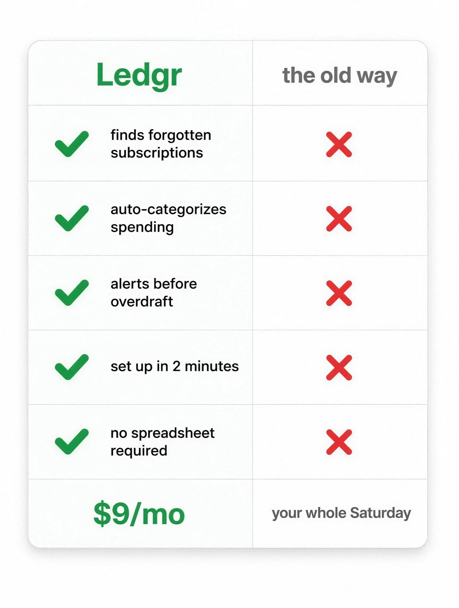
Comparison checklist: your column all green checks, theirs all red X's. Shameless, effective, forever.
Spec-list comparison ad, vertical 4:5, deep navy-to-black vertical gradient with a premium late-night tech feel. TOP: a dismissive, unbothered headline in thin white grotesk across two centered lines, ending in a period, exactly: "[HEADLINE — e.g. "This isn't a hard call."]". MIDDLE: two devices angle in from opposite frame edges like rivals meeting — left, a generic unbranded competitor rendered dark and half-silhouetted, cropped by the edge; right, [PRODUCT — e.g. "Veyra, a smart thermostat"] face-on and lit, display showing "[SCREEN — e.g. "72°"]". BELOW: the argument is column length. Two columns of small white spec type split by a thin vertical rule. Left header "[THEIR LABEL — e.g. "THE USUAL THERMOSTAT"]" with five short lines, the last a deadpan jab, exactly: "[JAB — e.g. "A very nice beige box"]". Right header "[PRODUCT NAME — e.g. "VEYRA"]" with at least twelve lines from "[SPEC LIST]" so it runs visibly twice as long. BOTTOM: a bold closing line, exactly: "[CLOSER — e.g. "The upgrade was never the question."]", a small logotype, then one grey legal whisper, exactly: "[FOOTNOTE — e.g. "Feature list abridged. Savings vary by home."]". Negative: no competitor brand names or logos, no icons, columns cleanly aligned, every word exactly as quoted, text crisp and unwarped.