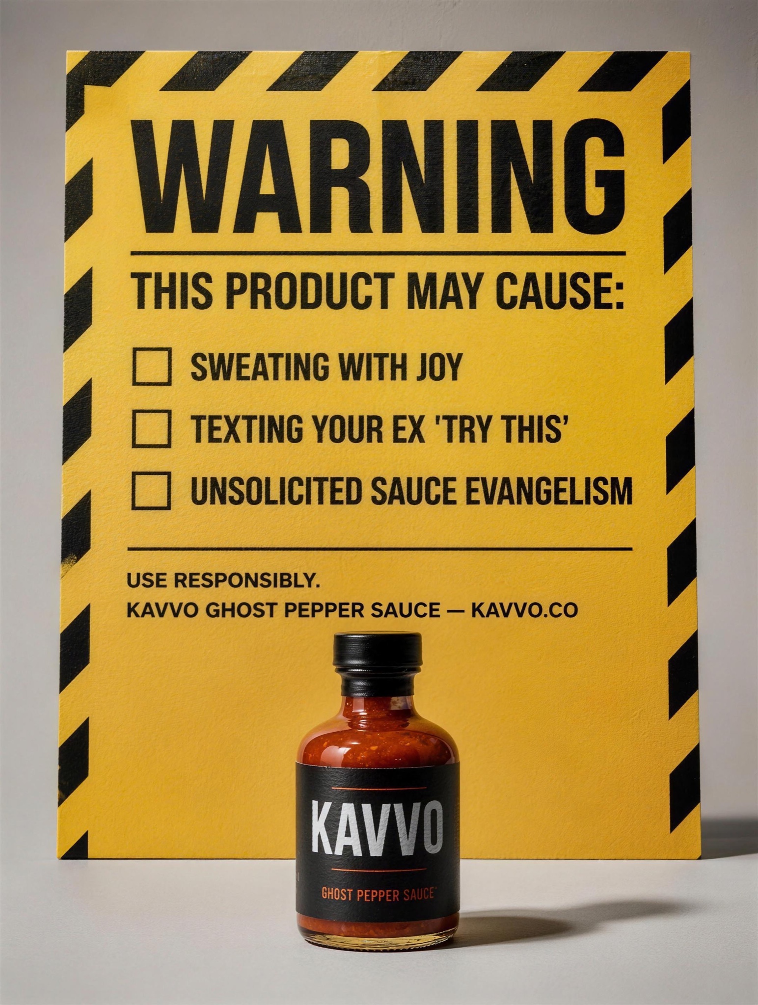
Hazard stripes hijack the brain's priority queue — people read official warnings before realizing it's a punchline.
Vertical 4:5 studio shot: [PRODUCT — e.g. "Kavvo, a ghost-pepper hot sauce in a stubby glass bottle"] standing centered on a seamless pale grey background, lit with hard directional light like a compliance photo. Dominating the upper two-thirds, a large official caution label rendered as a physical printed sign leaning behind the bottle: black-and-yellow diagonal hazard chevrons framing the top edge, then "WARNING" in massive black industrial caps, then "THIS PRODUCT MAY CAUSE:" in bold, followed by a left-aligned checklist with square checkboxes, each line verbatim: [SIDE EFFECTS — three comedic effects, e.g. "SWEATING WITH JOY", "TEXTING YOUR EX 'TRY THIS'", "UNSOLICITED SAUCE EVANGELISM"]. Below the list, a thin rule and small print reading "USE RESPONSIBLY." followed by [BRAND LINE — e.g. "KAVVO GHOST PEPPER SAUCE — KAVVO.CO"]. Typography: DIN-style safety signage lettering, tight kerning, true black on safety yellow. The product's own label stays clean and legible. Photorealistic paper and glass textures, slight vignette. All rendered text pin-sharp, level and correctly spelled; no warped letters, no extra hazard icons, no watermark.