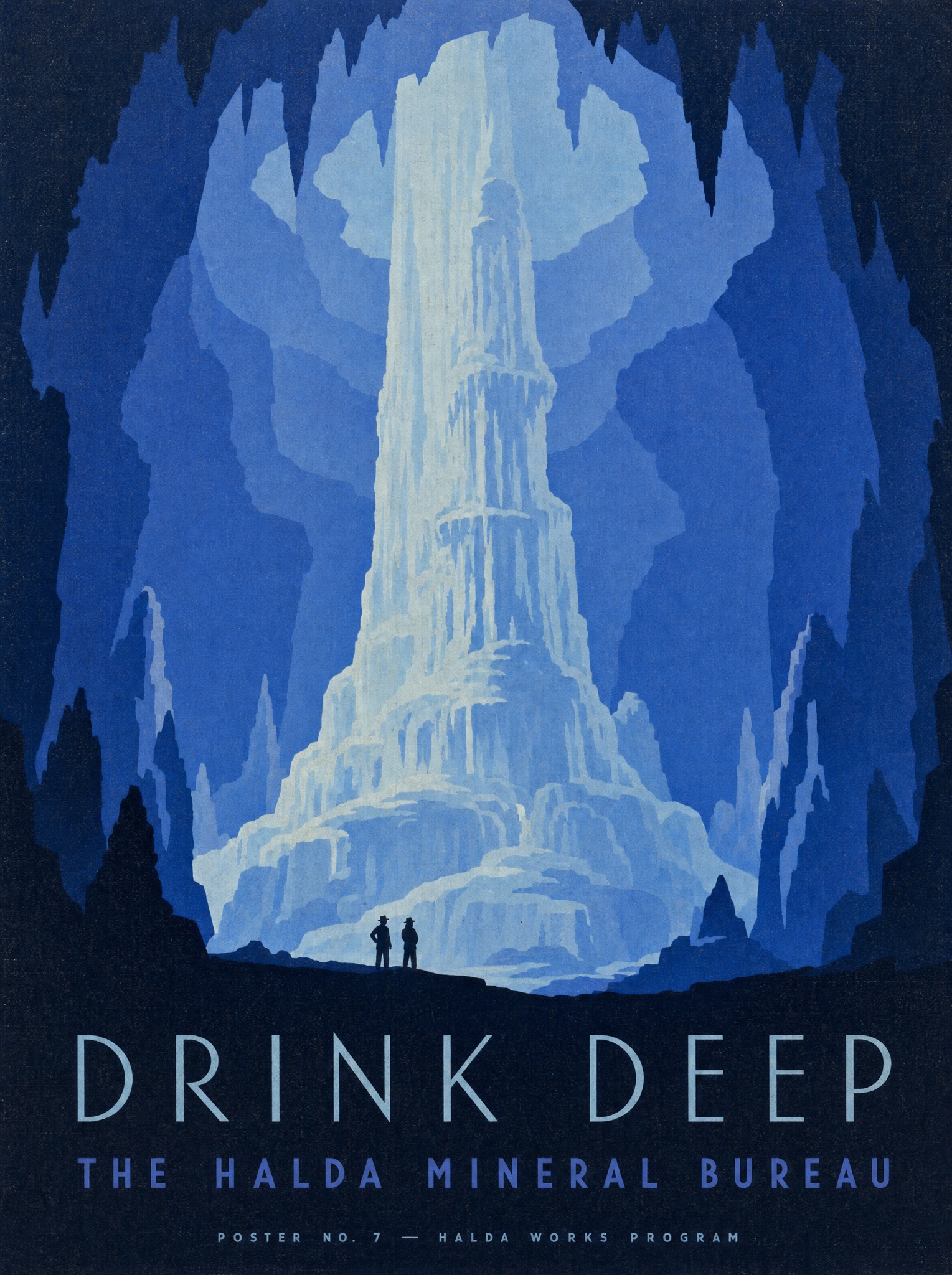
Flat serigraph shapes and one barked imperative — the public-works poster voice makes a product feel like civic duty.
Vertical 4:5 late-1930s American public-works serigraph poster, flat screenprinted shapes only. Subject: one monumental natural formation that embodies the product's source — [SUBJECT — e.g. "a towering mineral-spring column rising through a vast cavern, for Halda electrolyte mix"] — rendered as bold flat interlocking shapes in a strict five-value palette drawn from a single color family: [PALETTE — e.g. "ice blue, periwinkle, royal blue, deep indigo, near-black"]. At its base stand two tiny silhouetted figures in hats, dwarfed to ant scale, gazing up: the size gap between figure and formation is the entire drama of the poster. No outlines anywhere; every form is a clean flat color shape meeting the next, with shadow shapes cut in the darkest value. Bottom quarter, set on the near-black foreground: the headline in thin, widely letterspaced geometric deco capitals in the palest value, verbatim: "[HEADLINE — e.g. "DRINK DEEP"]", and beneath it a smaller letterspaced line in a middle value, verbatim: "[BUREAU LINE — e.g. "THE HALDA MINERAL BUREAU"]". Very bottom, one micro-credit line in tiny capitals: "[CREDIT — e.g. "POSTER NO. 7 — HALDA WORKS PROGRAM"]". Slight screenprint registration drift and paper grain throughout. No gradients, no photorealism, no colors outside the single family, no watermark, every quoted word exact.